Preview image. Unlock full-res
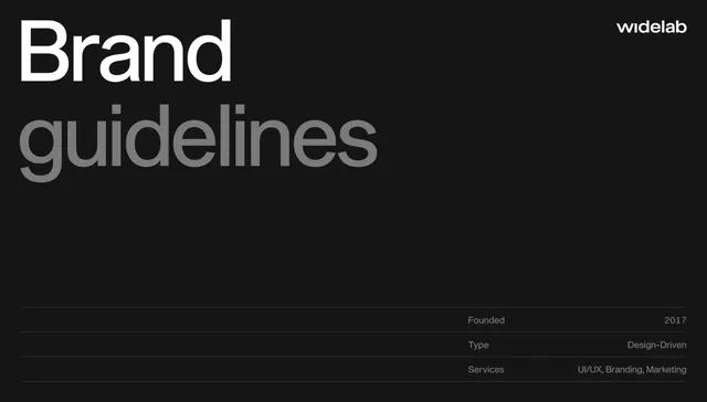
Corporate brand guidelines cover using monochromatic dark palette, bold display hierarchy, and information grid to establish professional authority and design-driven positioning.
Summary
Brand guidelines cover for widelab, a design-driven studio, combining oversized display typography with a structured metadata grid on a charcoal-black ground to signal professionalism and systematic design thinking.
Visual description
Dark charcoal/near-black background. Upper left: "Brand guidelines" rendered in large, bold, white sans-serif display type filling most of the compositional weight. Upper right corner: small "widelab" logo/wordmark in white. Lower third: structured information grid with left-aligned labels in medium gray and right-aligned values in white, displaying: "Founded 2017", "Type Design-Driven", "Services UI/UX, Branding, Marketing". Thin horizontal divider lines separate each row. The layout is stark, grid-based, with heavy use of negative space (the dark background) to emphasize typography as the primary visual element.
Key takeaway
The grid-as-structure approach: metadata becomes design through alignment and hierarchy rather than decoration. Using gray as a mid-tone between white and black creates subtle depth without introducing color. The oversized headline dominates while the information layer provides substance and credibility. This treatment works as both an arresting cover and a functional information display.
Reuse notes
Strong template for design studio, agency, or B2B service brand guidelines. The monochromatic treatment maintains focus on the type system itself, making it ideal when typography is a core differentiator. Scale the headline proportions up or down depending on brand personality. Works on both light and dark backgrounds if palette is inverted. Pair with a supporting color palette on interior pages to avoid monotony across a full document.
More like this


Keep what you find
A free account saves references to boards and can send you a weekly email of picks based on what you save.
To see every result, go Pro.