Preview image. Unlock full-res
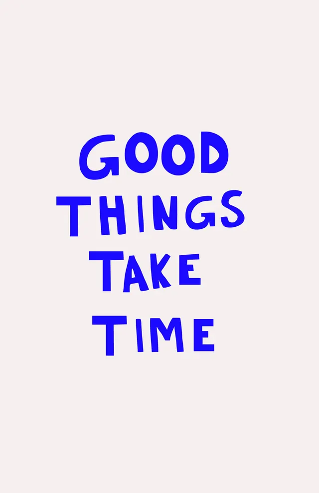
Minimal typographic poster with three-line message 'Good Things Take Time' rendered in bold, all-caps electric-blue sans-serif, centered on a neutral beige background with no imagery or ornament.
Summary
Pure typographic composition with vertically stacked, all-caps sans-serif words in electric blue declaring "Good Things Take Time" against a neutral taupe background, relying entirely on type scale and color contrast for impact.
Visual description
Centered on a light beige background: three lines of oversized, bold, geometric sans-serif typeface in bright electric blue. Text reads "GOOD / THINGS / TAKE / TIME" with each word on its own line, roughly equal letter-spacing and line-height. No additional imagery, decorative elements, or color variation. The letters fill the vertical frame space; the extreme simplicity and stark blue-on-beige contrast creates immediate visual hierarchy and legibility.
Key takeaway
The typographic minimalism is its strength: when the design is just type and color, the message lands unambiguously. The electric blue on taupe is a punchy, non-obvious pair that reads cool and approachable. All-caps geometric sans-serif conveys clarity and confidence without needing any supporting visual.
Reuse notes
Ideal for social media graphics, motivational posters, or brand tagline amplification. The simplicity makes it endlessly flexible across media sizes. Works for b2b, saas, or consumer brands seeking direct, confident communication. The beige-blue palette suits wellness, productivity, or purpose-driven messaging; avoid overuse if your brand already leans minimal.
More like this

Keep what you find
A free account saves references to boards and can send you a weekly email of picks based on what you save.
To see every result, go Pro.