Preview image. Unlock full-res
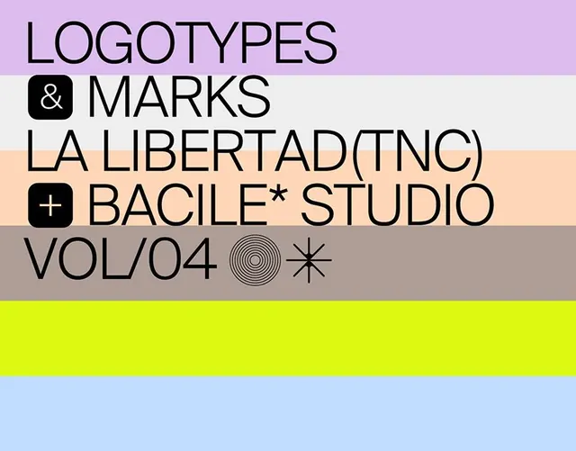
A type specimen showing multiple sans-serif families stacked across horizontal color bands in pastel and neon tones.
Summary
A type specimen showing five sans-serif families stacked across distinct horizontal color bands, mixing pastels (lavender, light pink, beige) with a bright yellow-green accent and light blue base.
Visual description
Five typeface families are displayed in a strict horizontal-stripe composition, each on its own colored band. The top band is lavender with "LOGOTYPES" in black uppercase display type. Below, "& MARKS" appears with a small black rounded-square symbol. The next band is cream-toned with "LA LIBERTAD(TNC)" in condensed sans-serif. A fourth band features "BACILE* STUDIO" with a small black cross/plus symbol. The bottom two bands show "VOL/04" with concentric circles and an asterisk-like mark in gray, followed by a bright neon yellow band and pale blue band at the base. All type is sans-serif, clean, and widely spaced.
Key takeaway
The use of distinct color stripes to separate and accent different typefaces without competing for attention. The pairing of pastel base tones with a single high-contrast neon band creates visual emphasis. Subtle geometric marks (squares, circles, asterisks) break the monotony of pure type display and suggest a publication or catalog system.
Reuse notes
Strong reference for type specimens, editorial systems, and publication design. The horizontal-band structure works well for showcasing multiple font families in a grid or catalog context. Best suited to editorial, academic, or design-focused portfolios where showing typeface variety is the goal.
More like this




Keep what you find
A free account saves references to boards and can send you a weekly email of picks based on what you save.
To see every result, go Pro.