Preview image. Unlock full-res
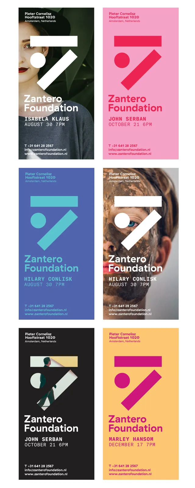
A six-poster brand system for Zantero Foundation built on a single rotating geometric shape and color-blocked backgrounds in saturated, high-contrast palettes.
Summary
A six-poster brand system for Zantero Foundation built on a single rotating geometric shape and color-blocked backgrounds in saturated, high-contrast palettes.
Visual description
Six vertical posters arranged in two rows of three. Each features a centered, bold geometric shape (a solid chevron or diagonal form) in white or bright accent color against a solid background field. The posters rotate through six distinct color combinations: forest green with white and pink accents, hot pink with magenta shape, cobalt blue with cyan accent, warm taupe with white shape, mustard yellow with magenta shape, and burnt orange with red shape. Typography sits anchored at the bottom in white all-caps sans-serif with hierarchical sizing: the brand name "Zantero Foundation" in a larger weight, followed by smaller subtext (designer/artist names and dates). The system demonstrates modularity through consistent layout, proportional spacing, and strict color discipline.
Key takeaway
The power of repeating a single geometric mark across a unified color system to build instant recognition. The poster format creates exhibition presence, and the saturated color blocking avoids gradients while maintaining visual drama. The four-to-five-color constraint per variation keeps the system replicable.
Reuse notes
Ideal for nonprofits, cultural institutions, and galleries wanting a bold, modern, modular identity that reads well at poster scale. Works best when each color variant can be printed or displayed as a standalone piece but read as part of a cohesive system. The geometric mark should be simple enough to scale down to small formats.