Preview image. Unlock full-res
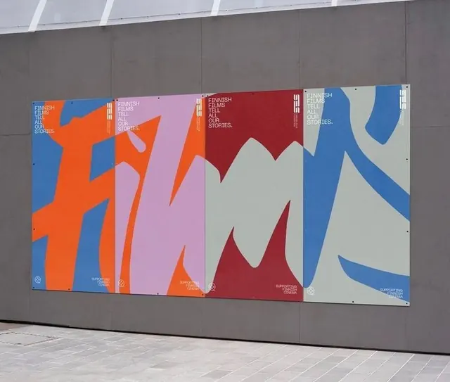
A series of five vertical posters featuring bold abstract biomorphic shapes in contrasting color pairs (orange-blue, pink-blue, red-white, blue-blue variations) with Finnish film festival branding.
Summary
Finnish Film Festival poster campaign using five modular vertical compositions of flowing biomorphic shapes in bold color pairs, mounted as an exhibition wall installation.
Visual description
Five poster-size panels hang side-by-side on a grey exterior wall beneath white architectural beams. Each panel (approximately 4:5 portrait ratio) is dominated by a single abstract biomorphic form composed of two or three overlapping curved segments, occupying roughly 60-70% of the composition. The first panel pairs bright orange and royal blue with a primary form resembling stacked organic shapes. The second shifts to hot pink and royal blue with more fluid curves. The third uses deep red and cream with angular biomorphic elements. The fourth and fifth present blue-dominant palettes with secondary colors. In the upper-left corner of each panel, small white all-caps text reads "FINNISH FILM TELL ALL OUR STORIES." with supporting supporting text and a small logo mark. The overall effect is rhythmic, with each poster part of a unified system yet individually striking through color variation.
Key takeaway
The biomorphic shape system works as both a standalone identity and a scalable modular poster series. By swapping color pairs while maintaining the form grammar, the festival achieves visual cohesion across multiple applications without rigid repetition. The restrained typography (small, white, top-aligned) doesn't compete with the bold forms, letting color and shape drive recognition and impact at a distance.
Reuse notes
Ideal for cultural institutions, festivals, or exhibitions seeking a modern, approachable visual identity. The abstract approach reads as inclusive and contemporary rather than tied to specific imagery or demographics. The color-swap strategy makes it economical for multiple poster runs or seasonal variations. Works well on both interior and exterior surfaces. The high contrast ensures legibility from a distance; the organic forms prevent the work from feeling sterile or overly technical.