Preview image. Unlock full-res
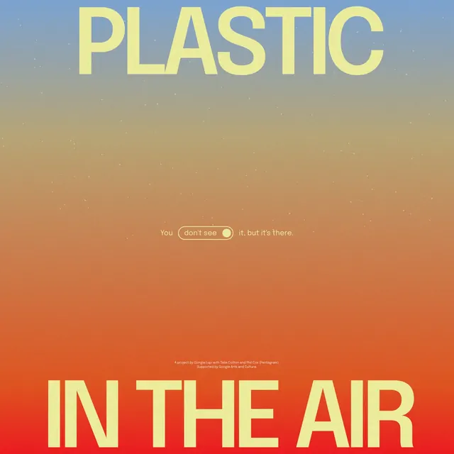
An environmental awareness poster using warm gradient typography, ranging from cool blue to hot orange, with a stark message paired against a vertical color shift.
Summary
An environmental awareness poster leveraging a vertical gradient backdrop (cool blue to warm orange) and oversized stacked typography to deliver an urgent, evocative statement about air pollution.
Visual description
A vertical poster composition divided into two halves by a smooth gradient: the upper section transitions from steel blue through muted tan to peachy-orange; the lower half deepens the orange-red toward the bottom. "PLASTIC" appears in large yellow-cream sans-serif caps in the upper portion, while "IN THE AIR" in white caps dominates the lower red-orange zone. Small supporting text sits between the two elements, providing context or campaign details. The gradient color progression creates a visual metaphor for rising heat, pollution, or urgency, while the stark two-word headline delivers the message with minimal linguistic noise.
Key takeaway
The color-gradient-as-narrative technique, where the background shift from cool to warm reinforces the message emotionally. The oversized, stacked headline structure that forces reader attention without decorative elements. The restraint in typography and supporting text, letting the gradient and headline do the communicative work.
Reuse notes
Strong for awareness or environmental campaigns where the emotional response is as important as the literal message. The cool-to-warm gradient is effective for topics suggesting urgency, heat, or escalation. Oversized sans-serif display type in caps holds impact at distance, suitable for outdoor posters, digital media, or print campaigns in editorial or nonprofit contexts.
More like this




Keep what you find
A free account saves references to boards and can send you a weekly email of picks based on what you save.
To see every result, go Pro.