Preview image. Unlock full-res
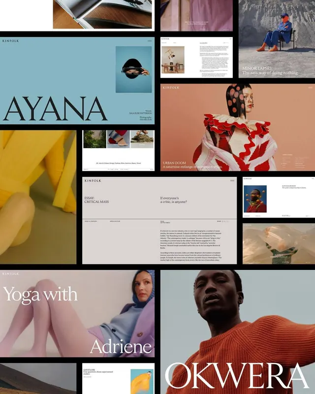
Curated editorial collage spanning multiple design projects with serif display headlines, portrait photography, minimalist layouts, and a warm earth-tone palette.
Summary
Curated editorial collage spanning multiple design projects with serif display headlines, portrait photography, minimalist layouts, and a warm earth-tone palette.
Visual description
A fragmented grid of six to eight distinct editorial spreads and branding applications arranged on a dark background. The collage includes: a teal background portrait with bold serif headline, a warm cream-and-tan editorial spread with serif "KINFOLK" masthead, a red and cream fashion publication layout with full-bleed female portrait, a cool gray-blue yoga lifestyle spread with serif display type "Yoga with Adriene," and mixed documentary-style photography. Serif typefaces dominate headlines (generous leading, classic proportions), while clean sans-serifs handle body text. Color palette bridges teal, warm cream, burnt orange, soft red, cool gray, and deep charcoal. Each spread shows intimate portraiture (often cropped, close) paired with expansive whitespace.
Key takeaway
The serif headline as a luxury editorial anchor. Generous leading and point-size contrast between display and body type. Warm neutral palette (cream, tan, soft red, teal) creating sophistication without vibrance. Full-bleed imagery cropped tightly around subjects for emotional impact. The grid-on-dark-background framing as a portfolio device.
Reuse notes
Strong reference for fashion, lifestyle, and cultural publications. Serif display pairs especially well with portraiture and minimalist layouts. The warm earth-and-teal palette works well for heritage or slow-living brands. Best used when you have compelling imagery and can give type generous breathing room. Not suitable for high-contrast or playful brands; this language reads expensive and editorial.
More like this






Keep what you find
A free account saves references to boards and can send you a weekly email of picks based on what you save.
To see every result, go Pro.