Preview image. Unlock full-res
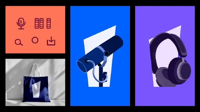
A modular icon system of six functional symbols and two 3D product illustrations using primary colors to organize distinct service verticals.
Summary
A modular icon system of six functional symbols and two 3D product illustrations using primary colors to organize distinct service verticals.
Visual description
Four panels arranged in a grid. Top-left (coral background) shows six line-drawn icons in dark maroon: a megaphone, grid of nine squares, microphone, magnifying glass, circle outline, and download arrow. Each icon is centered in its own cell, stroke-based and cleanly constructed. Top-right (bright blue) features a stylized microphone rendered in grayscale with soft shadows, tilted at an angle above a white rectangular base. Bottom-left shows a folded navy tote bag on a neutral fabric surface in muted gray, photographed in natural light. Bottom-right (purple background) displays over-ear headphones in dark purple and white, rendered in smooth 3D with soft highlights and shadow. All elements are crisply rendered with no blur or texture.
Key takeaway
Color-as-category: each panel uses a single bold background color (coral, blue, purple) to separate service types at a glance. Line-icon consistency: the six functional icons share weight, scale, and construction method, making them instantly readable and combinable. Icon-plus-hero approach: pairing functional line work with rendered product photos creates hierarchy without context.
Reuse notes
Ideal for media platforms, audio/streaming services, or productivity tools needing to showcase multiple features. The line icons work well at small sizes; the product renders establish brand presence at larger scales. Use the primary colors sparingly to avoid visual chaos; let icons breathe on clean backgrounds. The monochromatic product photos pair well with the flat icon panel.
More like this

Keep what you find
A free account saves references to boards and can send you a weekly email of picks based on what you save.
To see every result, go Pro.