Preview image. Unlock full-res
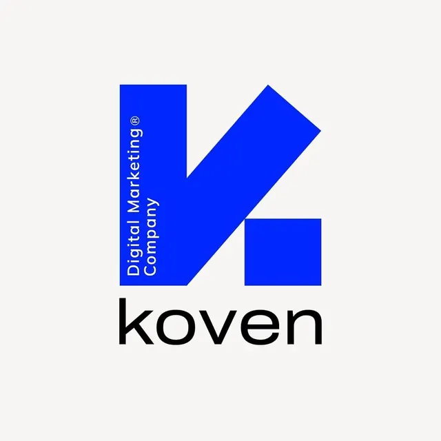
A bold royal-blue 'k' lettermark built from three geometric blocks with vertical white tagline text running through the left stem, above a black lowercase wordmark for Koven.
Summary
A digital-marketing agency lettermark for Koven built from three solid blue geometric blocks that form a lowercase 'k', with the tagline "Digital Marketing Company" set vertically in white inside the left stem, paired with a black lowercase wordmark below.
Visual description
On an off-white background, the lettermark uses three flat royal-blue shapes: a tall left rectangle, a diagonal ascending stroke, and a detached square forming the lower leg. Inside the left bar, white sans-serif text reads bottom-to-top, including a small registered-trademark symbol. This structural use of tagline text makes the descriptor inseparable from the mark itself. Below the 'k', "koven" appears in a clean, heavy black sans-serif with open counters, set in lowercase. The color palette is strictly white paper, blue, and black with no gradients, shadows, or outlines.
Key takeaway
Embedding a tagline or secondary line vertically inside a lettermark's stem so the descriptive text becomes a structural element rather than a separate line of copy. The detached square leg of the 'k' prevents the form from reading as a regular typed character, reinforcing its status as a custom constructed mark.
Reuse notes
Effective for agency or studio marks needing a strong single-letter symbol plus built-in recognition copy at large scales. The three-block construction fragments cleanly for animation or modular brand applications. Caveat: vertical sub-copy remains legible at display size but becomes unreadable at favicon scales, so provide a simplified version for small contexts.