Preview image. Unlock full-res
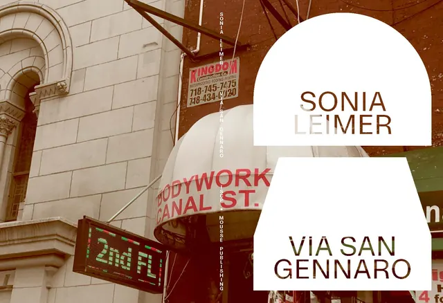
A custom wordmark and address for Sonia Leimer overlaid as white semi-transparent badges on a gritty street-sign and architectural background.
Summary
A luxury branding identity for Sonia Leimer overlaid as semi-transparent white badges on a richly detailed backdrop of vintage street signage and architectural detail, merging contemporary clarity with aged urban character.
Visual description
The composition layers two clean white rounded rectangles over a photograph of worn brick walls, faded metal signage, and industrial architecture. The top badge reads "SONIA" in a serif/display hybrid (khaki) and "LEIMER" in lighter weight serif (pale cream), while the lower badge displays "VIA SAN GENNARO" in a clean serif. Visible background signage includes faded red text ("BODYWORK", "CANAL ST", a phone number) and green neon lettering ("2nd FL"), creating a layered depth of signage ages. The color palette is warm: oxidized browns, cream, white, with deep burgundy and olive accents from the aging metal and painted surfaces.
Key takeaway
The contrast between ultra-clean, minimal typography and a complex, gritty photographic backdrop. The use of transparency and rounded-corner containers to create a clean brand moment within a cluttered environment. The serif-serif pairing for wordmark sophistication. The restraint of using two simple badge shapes rather than competing with the background.
Reuse notes
Ideal for luxury, editorial, or upscale service brands wanting to root themselves in a specific place or history. The technique works when you have authentic, visually interesting architecture or signage to anchor. Avoid if the background imagery is generic or distracts from the core message.