Preview image. Unlock full-res
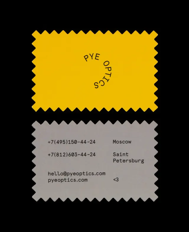
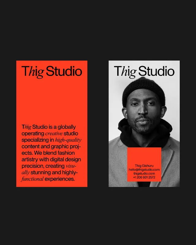
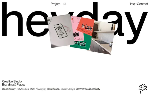
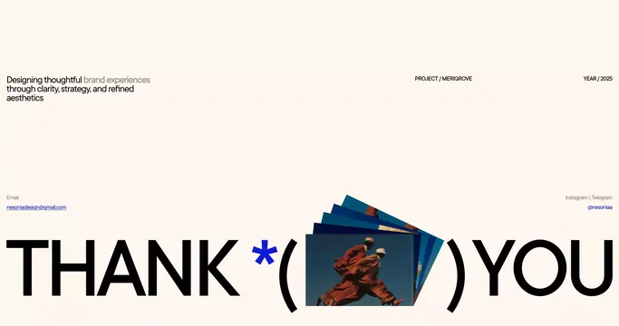
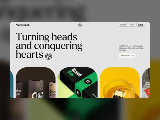
A boutique design studio homepage with bold serif headline, modular portfolio grid of vivid project cards in complementary colors, and minimal navigation.
Summary
A design studio landing page with a large serif headline, tagline, and a horizontal carousel of four vivid project-card mockups in distinct colors, anchored by minimalist navigation and CTA.
Visual description
A clean, light gray layout with a gray blurred background peek at top. Header bar contains "NiceAtNoon" logotype (small, modern sans-serif) with a circular icon, and three right-aligned nav buttons (Projecten, Over, Contact). The dominant hero headline reads "Turning heads and conquering hearts" in a flowing serif font, occupying two-thirds of the left column in deep charcoal or black. A small circular icon repeats to the right of the text. In the right column, a two-line gray sans-serif tagline sits over a white button ("Bekijk projecten") with an arrow. Below, a horizontal gallery of four visible project mockup cards with rounded corners, each with vivid background colors: muted brown, emerald green with neon accent type, golden yellow, and partially visible red. Each card shows cropped UI details or branding elements from the featured projects.
Key takeaway
The modular card system with distinct saturated colors makes a portfolio feel cohesive yet dynamic. The serif headline paired with tight sans-serif tagline establishes a clear visual hierarchy. The organic white space and restrained navigation keep the user focused on the work, not the interface.
Reuse notes
Ideal for design agencies, creative studios, and portfolios seeking to showcase multiple projects without visual clutter. The bold card colors work best when each project has a distinct brand identity. Not recommended for minimalist or monochrome-focused brands, or when only one or two projects are featured.