Preview image. Unlock full-res
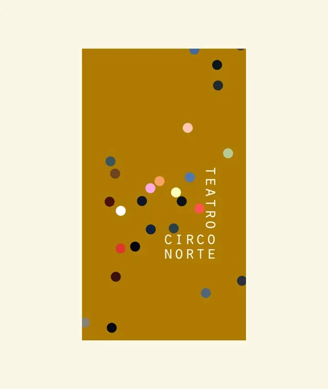
Mustard-yellow rectangular poster featuring scattered, variously colored circles of different sizes and a right-aligned sans-serif typographic treatment naming a theatrical production.
Summary
A vertically oriented poster on a solid mustard-yellow field with randomly scattered polka dots in varied sizes, hues (navy, coral, white, sage, burgundy), and a diagonal text treatment reading "TEATRO CIRCO NORTE" in white sans-serif capitals positioned right of center.
Visual description
A large rectangular field in rich mustard-gold occupies the majority of the frame against a pale cream or off-white outer margin. Across the mustard surface, dozens of small circles are scattered non-uniformly in colors including navy, soft white, coral-pink, warm burgundy, pale mint, and dark gray. The circles vary in diameter from roughly 10px to 40px, creating visual rhythm through size randomness. "TEATRO" appears vertically in the right third of the composition, followed immediately by "CIRCO NORTE" stacked horizontally below it, all rendered in white sans-serif capitals with generous letterspacing. The text anchors in the lower-right quadrant, balancing the weight of the dots above.
Key takeaway
The dot scatter technique adds tactile, organic randomness to a graphic field without illustrative complexity, and differing circle sizes make randomness feel intentional rather than careless; restricting the palette to the warm ground color plus a tight set of accent hues (navy, coral, white) keeps dots legible against the busy field; right-aligning the type in a vertical/stacked pattern is unusual enough to feel fresh and modern, breaking expectation of centered theatrical typography.
Reuse notes
Effective for cultural institutions, art venues, and theatrical organizations where a modern sensibility pairs with warm, inviting visual language. The dot motif works especially well at poster and promotional scale. The palette is distinctive and memorable. Lighter backgrounds than this mustard would reduce the impact of the dots; busier compositions risk chaotic feel. Pairs well with playful serif or serif display type for event-specific secondary messaging.