Preview image. Unlock full-res
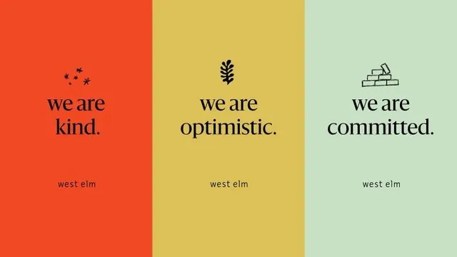
West Elm brand values conveyed through three distinct color-blocked panels, each pairing a core value with a simple icon and black serif type.
Summary
West Elm's core brand values presented as a vertical triptych: each color panel pairs a single value word (kind, optimistic, committed) with a subtle line-icon and the company name in lowercase.
Visual description
A three-column poster divided into equal vertical sections. The left panel is bright red-orange with a small constellation of stars and the serif headline "we are kind." The center panel is warm mustard yellow with a minimalist leaf icon and "we are optimistic." The right panel is soft mint green with a simple stacked-bricks icon and "we are committed." Each panel displays "west elm" in small black sans-serif at the bottom. The palette moves through warm (red-orange to yellow) to cool (green), creating visual rhythm and tonal movement across the composition.
Key takeaway
The three-color blocking system as a framework for multi-value messaging. Each color gets its own space and visual weight, preventing any value from being subordinated. The pairing of a single icon plus a single word plus the company mark creates a modular, memorable format easy to replicate or extend. The warm-to-cool color journey (orange -> yellow -> green) feels intentional and energetic without being chaotic.
Reuse notes
Strong for lifestyle, retail, or consumer brands with three or more core values to communicate. Works especially well when those values are abstract (kindness, optimism) because the icons give them visual identity. The serif type on a sans body creates contrast. Best deployed as a social-media series, employee onboarding, or brand principles wall.