Preview image. Unlock full-res
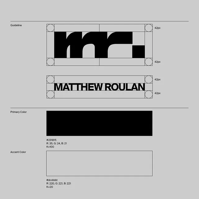
A design system specification showing a geometric wordmark with strict grid constraints, measured clearance rules, and a two-color palette with RGB and CMYK values.
Summary
A design system specification showing a geometric wordmark with strict grid constraints, measured clearance rules, and a two-color palette with RGB and CMYK values.
Visual description
Three distinct sections. Top: "Guideline" label followed by a logo construction grid showing a black and white geometric mark (stylized letters m, r, or numerals formed by rounded and sharp shapes) with four corner circles marking 42px clearance zones and horizontal divisions. Center: "MATTHEW ROULAN" spelled in a heavy, all-caps sans-serif (likely a contemporary geometric or grotesque family like Futura or similar) with 42px top and bottom clearance boxes. Bottom: "Primary Color" swatch showing solid black (#231815, K=100) and "Accent Color" showing light gray (#dcdcdd, K=20) with exact RGB and CMYK breakdowns printed below each. Gray background field encompasses all elements. Thin black rules separate sections. Visible grid lines and corner-radius indicators reinforce the systematic nature.
Key takeaway
Documenting the clearance zone (the 42px breathing room) enforces respect for the mark and prevents adjacent elements from crowding it. Showing both RGB and CMYK values (with K%, CMY percentages) means the guideline travels to print vendors, screen implementers, and vendors without reinterpretation. The geometric wordmark itself (negative shapes creating letter forms) is scalable and works in one color, full color, or reversed.
Reuse notes
Ideal template for corporate rebrand guidelines, agency portfolios, or founder/director brands seeking precision and authority. Works across business cards, websites, and building signage due to strict proportions. Best suited for industries valuing order (law, finance, architecture, design consultancy). The brutalist geometry may feel cold for consumer brands unless offset with warmer copy or imagery.
More like this






Keep what you find
A free account saves references to boards and can send you a weekly email of picks based on what you save.
To see every result, go Pro.