Preview image. Unlock full-res
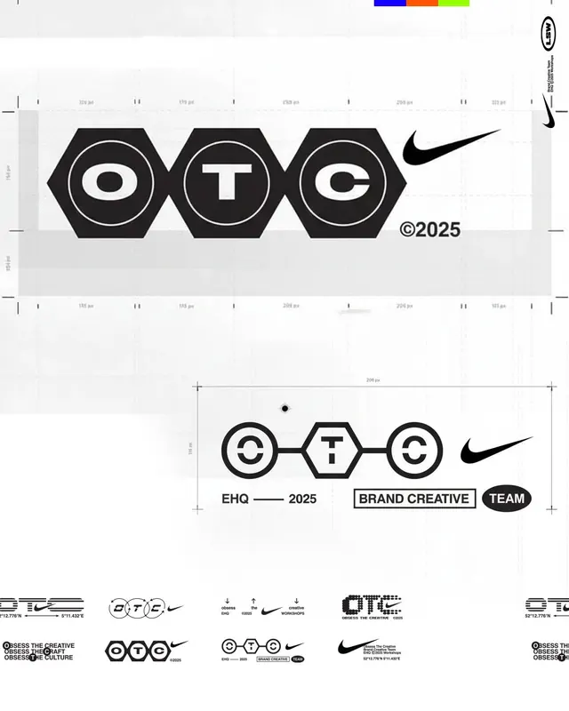
A monochromatic brand system with three interlocking hexagons containing letters, paired with the Nike Swoosh and strict geometric construction guidelines.
Summary
A geometric brand identity with three black hexagons containing the letters O, T, C, interlocked in a clean horizontal arrangement, accompanied by construction specs, measurement callouts, and usage rules.
Visual description
Three stacked hexagon shapes are filled in black with white inner circles. Inside each circle sits a white letter: O, T, C. The hexagons overlap slightly where they meet. Dimension lines and measurement annotations in light gray extend vertically and horizontally from the mark, labeling spacing in pixels (e.g. "200 px," "110 px"). A color palette strip at the top right shows blue, orange, and lime green. Below the primary mark is a secondary lockup showing the three circles connected by horizontal bars with the text "EHQ" and "2025" alongside, labeled with brand terminology ("BRAND CREATIVE", "TEAM"). A small Nike Swoosh appears as a signature mark. The page also displays design variations and taglines emphasizing brand philosophy and structure.
Key takeaway
The use of negative space inside the hexagon to frame each letter for maximum legibility. The systematic grid-based measurement approach that documents proportions for consistent reproduction. The layered lockup system showing multiple contexts (primary mark, secondary lockup, tagline variations) on a single page for clarity.
Reuse notes
Ideal for tech, agency, and corporate branding where precision and systematic documentation are assets. The high-contrast black-and-white geometry works across digital and print. The modular hexagon structure allows each letter to stand alone. The subtle color accent strip can be omitted or expanded depending on context. Works at large and small scales due to clean geometry.
More like this





Keep what you find
A free account saves references to boards and can send you a weekly email of picks based on what you save.
To see every result, go Pro.