Preview image. Unlock full-res
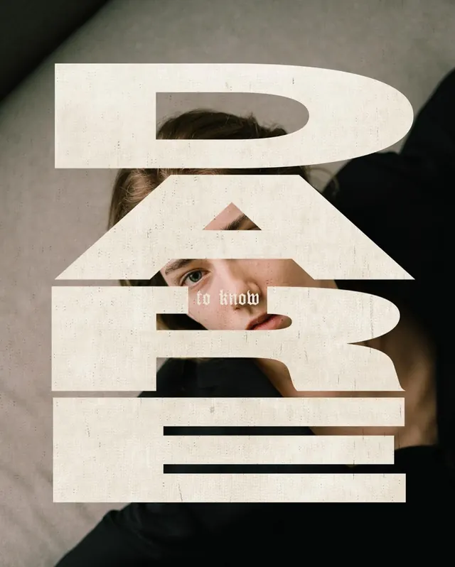
Fragmented white typography stacked horizontally, each letter revealing portions of a sepia-toned portrait underneath, creating a distressed editorial effect.
Summary
Thick horizontal white letterforms stacked vertically reveal a sepia-toned portrait beneath, using negative space and paper cutout technique as a core typographic strategy.
Visual description
A series of wide, chunky white rectangular bands appear cut or stacked on top of each other, each band containing negative space that reveals portions of a sepia-toned portrait beneath—eyes, facial features, and the neckline visible through geometric openings. The bands suggest large capital letters arranged vertically. Horizontal black lines sit below some bands, adding compositional rhythm. The overall effect is a brutalist, architectural treatment of typography where form and revelation work together. The background shifts from warm skin tones to deep charcoal-black fabric. The composition is symmetrical and vertical, evoking fine art or editorial photography.
Key takeaway
Using negative space and fragmentation to reveal content beneath letterforms creates immediate visual intrigue and a conceptual link between the text and its subject. The systematic stacking of geometric bands creates order within a complex visual moment. The interplay of warm skin tones against cool blacks and cream whites gives the piece emotional weight without color variance.
Reuse notes
Excellent reference for editorial design, fashion branding, or art-direction that needs to convey sophistication with a contemporary edge. The cutout technique works best with strong portraiture as the revealed element. Challenging to execute at small scale; more impactful at poster, cover, or large-format applications. Conveys an aspirational, gallery-quality aesthetic that pairs well with premium brands or publications.
More like this






Keep what you find
A free account saves references to boards and can send you a weekly email of picks based on what you save.
To see every result, go Pro.