Preview image. Unlock full-res
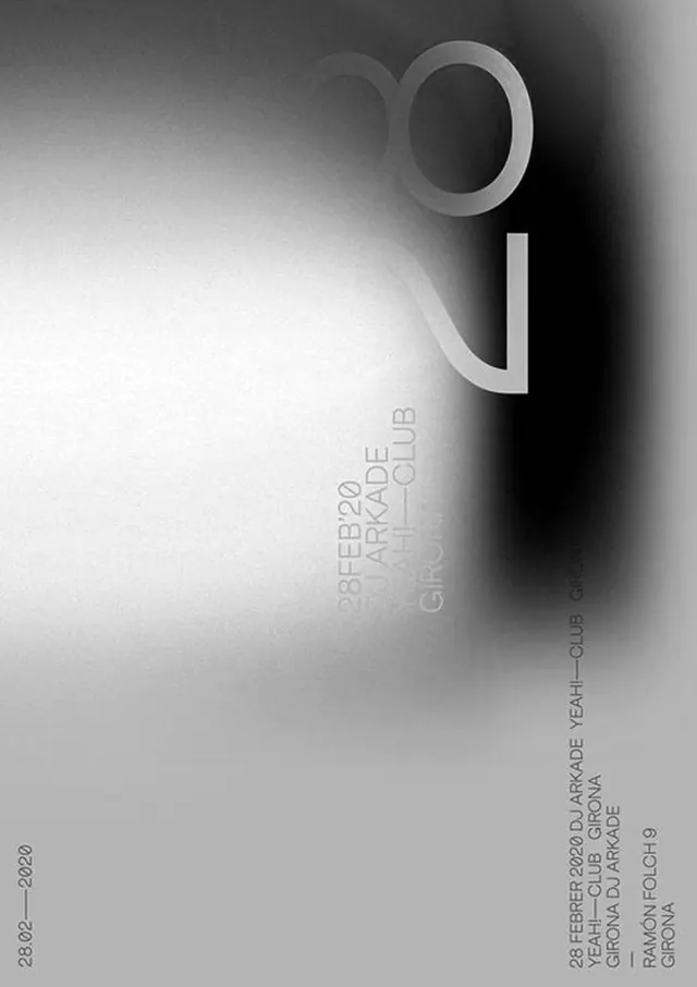
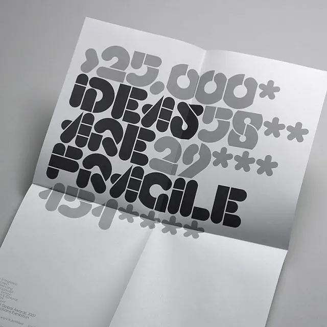
Abstract type specimen featuring large geometric letters in bold sans-serif against a soft black-to-white gradient, paired with detailed event information in small caps.
Summary
Abstract type specimen featuring large geometric letters in bold sans-serif against a soft black-to-white gradient, paired with detailed event information in small caps.
Visual description
Two large, sculptural sans-serif letters (an uppercase O and lowercase u) dominate the composition, taking up roughly 40 percent of the frame and rendered in light gray. A smooth gradient fills the background, transitioning from pure black on the right edge through mid-grays to bright white on the left, creating depth without any visible gradation. Below and to the right, aligned flush right, is a vertical stack of smaller text in light gray: event title, date, location, and website, set in all small caps with tight tracking. The overall effect is minimal and sophisticated, with the letterforms floating in the tonal gradient.
Key takeaway
The use of a smooth luminosity gradient (not a color gradient) as the sole background element creates atmospheric depth and guides the eye without distracting. Pairing dominant display type with small-caps body text creates clear hierarchy and elegance. The asymmetrical placement of the small text offsets the visual weight of the large letters naturally.
Reuse notes
Excellent for event promotion, music venues, or cultural institutions where sophistication and mystery work together. The monochrome palette reads as timeless and contemporary simultaneously. Scale down the letterforms if you need space for imagery or additional branding elements; the layout can survive tighter compositions. Not ideal for industries requiring warmth or approachability.
More like this






Keep what you find
A free account saves references to boards and can send you a weekly email of picks based on what you save.
To see every result, go Pro.