Preview image. Unlock full-res
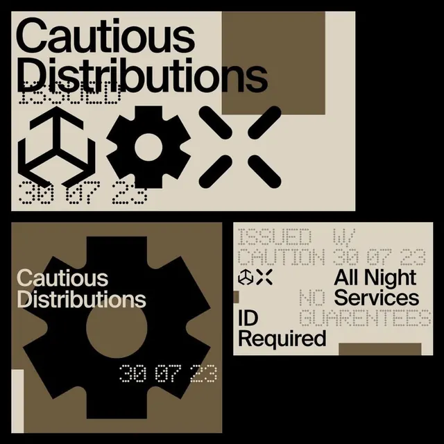
Modular branding system for Cautious Distributions using geometric symbols (triangle, gear, X) paired with chunky sans-serif type on cream and dark backgrounds with brown and tan accents.
Summary
A brutalist identity system for "Cautious Distributions" combining stark geometric icons (pointing hand, gear, X-mark) with heavy sans-serif type across modular cream, tan, and black panels printed with date-time stamps and service descriptors.
Visual description
Three-panel grid showing a cohesive branding system. Top-left panel: cream background with black "Cautious Distributions" in chunky all-caps sans-serif, followed by a row of three geometric icons (upward-pointing triangle, multi-toothed gear, crossing X) and "30 07 23" text. Bottom-left panel: dark brown background with cream type repeating the brand name and icons with time/date notation. Right panel: cream background with text "All Night Services," "ID Required," and other operational copy on white and light tan rectangles, creating a stark graphic tension. The palette is intentionally austere, pairing cream and off-white against pure black and warm brown, with no color variance within panels. Spacing is tight and utilitarian.
Key takeaway
The modular panel approach lets a simple brand identity expand across multiple surfaces without a unified lockup. Geometric icons reduce a service concept to three essential marks (access, operation, utility). The dated/timestamped approach adds institutional credibility to what might otherwise feel arbitrary.
Reuse notes
Effective for services, events, or operations needing an authoritative, no-nonsense voice. The earthy warm tones and mechanical symbols work well for music venues, distribution networks, or industrial services. The panel-based system scales from labels to signage. The date-time stamps suit limited editions, events, or time-sensitive applications.