Preview image. Unlock full-res
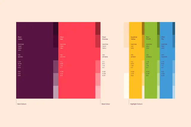
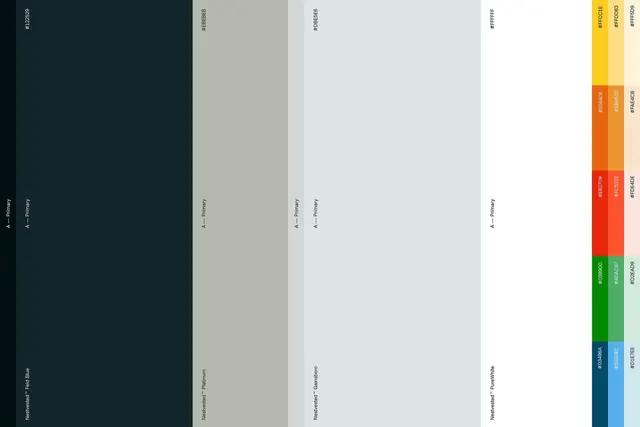
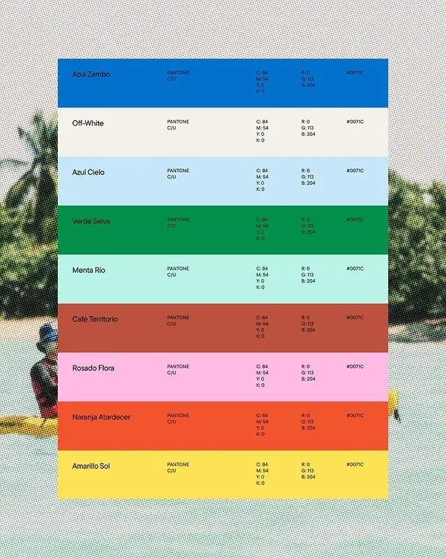
Stacked horizontal color bars with Pantone references, CMYK and RGB values, and color names spanning cool blues through warm yellows and greens.
Summary
A functional color palette guide showing eight stacked color swatches with Pantone codes, CMYK, RGB, and hex values, paired with Portuguese color names (Azul Zambo, Azul Cielo, Verde Selva, Menta Rio, Cafe Territorio, Rosado Flora, Naranja Atardecer, Amarillo Sol).
Visual description
Eight horizontal bars of solid color fill the frame left to right: a royal blue at top, a light sky blue, a forest green, a pale mint, a muted terracotta, a dusty rose, a bright orange-red, and a golden yellow at the bottom. Each bar is equal width and height, creating a clean grid. To the right of each color, a small text block displays the color name on the left, "PANTONE" and a code in the center, and CMYK and RGB values on the right, all in small black sans-serif type on a white background. The layout is systematic and legible: pure function over decoration. A partially visible plant or feathery texture appears at the top left, suggesting the image may be photographed against a styled surface rather than a pure white background.
Key takeaway
The inclusion of multiple color formats (Pantone, CMYK, RGB, hex) in one compact reference makes this palette immediately usable across print and digital workflows. The clear, left-aligned text column beside each color sample is readable at small sizes. The color names, in Spanish, add character while remaining professional.
Reuse notes
Useful for branding work that needs to specify spot colors and match color across print, screen, and web. The palette itself spans a warm-to-cool range with good separation, making it suitable for identity systems that need color variety without clashing. The bilingual or regional naming signals a Latin American design context.