Preview image. Unlock full-res
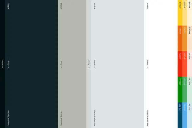
Structured vertical color palette specimen showing primary, secondary, and accent hues across a dark-to-light value range with hex codes and semantic labels.
Summary
Structured vertical color palette specimen showing primary, secondary, and accent hues across a dark-to-light value range with hex codes and semantic labels.
Visual description
A methodical grid of vertical color strips. The left side shows deep charcoal and neutral greyish-tan, each labeled "A - Primary". The center columns display pale grey-blue and light cloud tones, also labeled "A - Primary". A wide right section displays saturated accent colors arranged in bands: bright mustard yellow shading to pale yellow; burnt orange to peachy salmon; vivid red-orange to soft coral; pure lime-green to pale mint; dark teal to sky-blue. Each color strip bears a monospaced hex code label vertically oriented (e.g. #FFD033, #FFC033) and a semantic category label ("A - Primary" or named colors like "Goldenrod" and "Platinum"). The overall composition is clean and modular, emphasizing the deliberate interplay between neutral foundation colors and chromatic accents.
Key takeaway
The use of semantic naming (Primary, Secondary, Accent, Tints) alongside hex codes for immediate designer-to-developer communication. The clear visual hierarchy: muted neutrals anchor the left, vibrant accents command the right, making the relative role of each hue instant. The vertical strip format allows rapid color comparison and is highly legible in scaled contexts.
Reuse notes
Essential reference for designing a cohesive UI color system or brand palette specification. Works particularly well for digital product design where developers need both hex values and semantic intent. The modular grid layout translates directly to design-tokens or CSS custom-property documentation.