Preview image. Unlock full-res
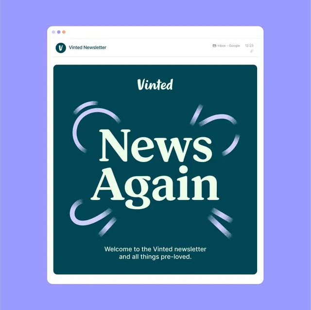
Email newsletter interface for Vinted showing a deep teal content area with serif logo lettermark, hand-brushed accent marks, and cream text hierarchy on a purple gradient background.
Summary
Email newsletter template for Vinted (secondhand fashion marketplace) showing a teal-and-cream visual identity system with serif lettermark, hand-brushed geometric accents, and two-tone typography on gradient surround.
Visual description
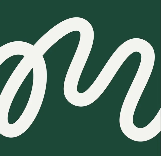
A macOS window chrome frames a newsletter email mockup. The header is light neutral cream. Below, a dark teal rounded rectangle dominates the content area, with the Vinted "V" circular logo in the upper left (cream circle with dark teal mark). Centered in large serif type, the text "News Again" is set in off-white, flanked by four hand-drawn brushstroke accents in pale purple in the corners (sketchy, organic curves). A single line of sub-copy in smaller cream sans-serif reads "Welcome to the Vinted newsletter and all things pre-loved." The entire mockup sits on a light purple-to-lavender gradient background, creating a soft, premium container.
Key takeaway
The teal-and-cream two-color system reads as calming and trustworthy without being sterile. The hand-brushed accents (sketchy, asymmetric) inject personality and organic warmth into a minimal layout; they are restrained (not overwhelming) but clearly felt. The serif headline type paired with sans-serif body text creates clear hierarchy while staying cohesive. The approach is ideal for lifestyle, thrift, or secondhand-focused brands where authenticity and gentleness matter.
Reuse notes
Pairs well with marketplace or circular-economy brands. The color choice (teal + cream) is high-contrast enough for accessibility while remaining muted and sophisticated. Works for newsletter templates, brand identity systems, or interface design where a friendly but premium tone is needed. The brushstroke ornaments work best at large scale and should not be over-applied; this shows effective restraint.