Preview image. Unlock full-res
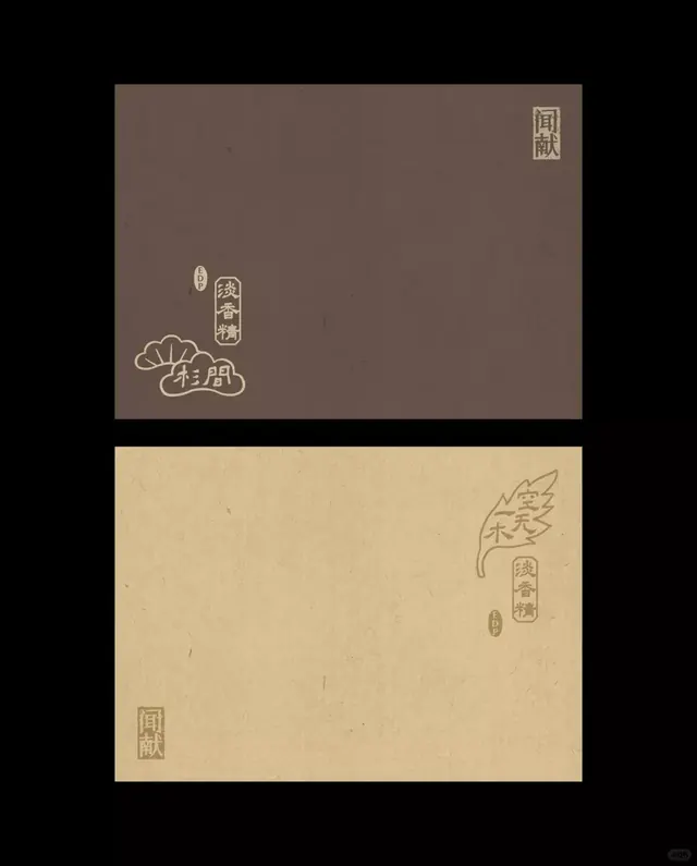
Two textured paper cards in aubergine and kraft tan carry gold-stamped Chinese characters and seal marks, an understated identity built almost entirely from empty space.
Summary
Two fragrance cards, one aubergine-brown and one kraft tan, each stamped with vertical Chinese characters, a boxed seal mark, and a small "EDP" oval, on a black backdrop. The identity leans almost entirely on emptiness and small gold-toned marks.
Visual description
The image stacks two rectangular paper panels on a pure black field. The upper panel is a muted purple-brown with visible fiber flecks; its marks cluster low-left, a stacked column of three characters inside a thin border, a tiny EDP oval, and a hand-drawn fan-shaped emblem with two characters below. A small square seal sits in the top-right corner. The lower panel is warm kraft tan with the same flecked texture; its marks sit upper-right, including a leaf-like outlined motif wrapping a vertical character column, with a matching square seal anchored bottom-left. All marks are printed in a soft metallic gold-brown that barely lifts off each ground, leaving most of each card as bare textured paper.
Key takeaway
Anchoring brand marks to opposite corners and letting 80 percent of the surface stay empty textured stock reads as quiet luxury. Repeating one boxed seal across two different paper colors ties a range together without a logo lockup. Tonal gold-on-brown printing gives richness while staying nearly monochrome.
Reuse notes
Reach for this on heritage, apothecary, tea, or fragrance packaging where restraint signals quality. It depends on real paper texture and foil or tonal printing, so it loses its character on flat screen-only output. Keep marks small and let the stock breathe.
More like this



Keep what you find
A free account saves references to boards and can send you a weekly email of picks based on what you save.
To see every result, go Pro.