Preview image. Unlock full-res
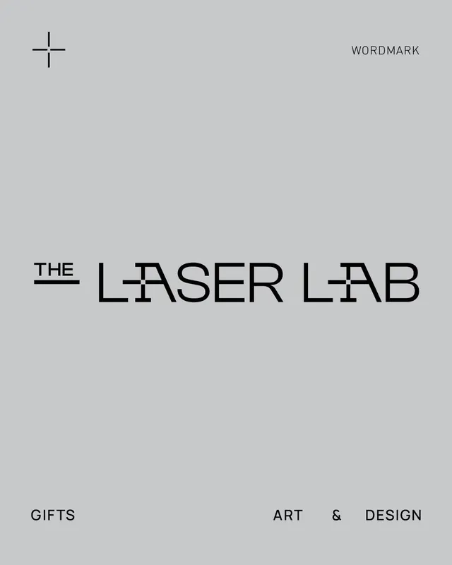
Minimalist wordmark for a design lab featuring a slender plus sign icon and clean serif-influenced display type across a light gray field.
Summary
A minimalist wordmark for a design lab pairing a geometric plus-mark icon with clean, tightly-letterspacedisplay-weight sans-serif type across an achromatic gray palette.
Visual description
Light gray background with a single centered plus sign rendered as four overlapping strokes (with slight serif-like terminals) positioned in the upper left. Below and to the right, the wordmark "THE | LASER LAB" spans the lower half in black sans-serif capitals, with "THE" underlined by a thin horizontal rule. "LASER LAB" uses letterspacing and a medium-weight typeface with subtle geometric proportions. A small label "WORDMARK" appears in the upper right corner in gray caps. The overall composition balances the icon's vertical-horizontal axis with text positioned to fill empty canvas space deliberately.
Key takeaway
The plus sign as a self-contained icon works independently; pairing it with logotype leaves breathing room for use as a system mark or favicon. The thin rule under "THE" anchors hierarchy without being decorative. The generous letter spacing and gray-on-gray label suggest a typographically-focused identity system.
Reuse notes
Well-suited to tech-focused or professional-services brands where a geometric, construction-based mark signals precision and minimalism. Works equally well in one-color contexts. The extreme simplicity scales down to favicon size. Note the gray label suggests this is a style-guide specimen, so the core identity is the plus mark plus wordmark without annotation.