Preview image. Unlock full-res
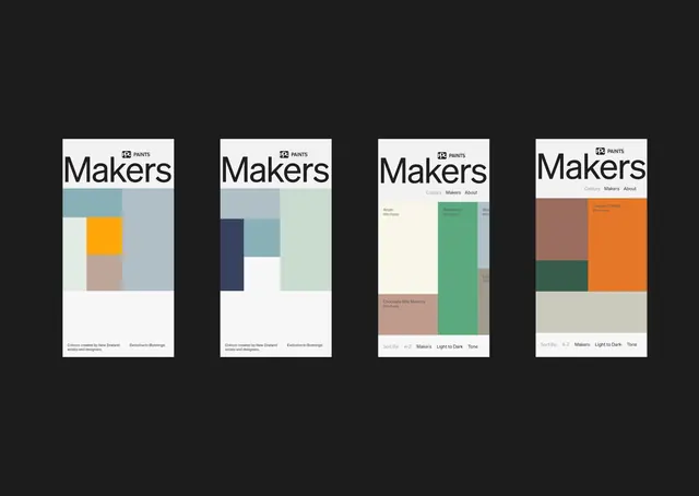
Four-panel typographic layout showing a color-selection interface with labeled swatches, demonstrating palette curation and hierarchical browsing in a minimalist design system.
Summary
A multi-panel typographic mockup displaying a modular color-picker interface with labeled palette swatches, sorting controls, and consistent grid-based layout across four variations.
Visual description
Four vertical panels arranged horizontally, each showing the same interface structure with the word "Makers" at the top. Each panel displays a unique color palette: the first uses teal and soft orange on pale backgrounds, the second navy and light cyan, the third green and tan, the fourth warm tan and burnt orange. Each panel contains a grid of color blocks labeled with paint/color names and organized into visual categories. Below each palette are small control text ("Colour curated by New Zealand artists and designers" / "Sort By: A-Z / Makers / Light to Dark / Tone") in a compact sans-serif. A dark gray background frames the entire composition, emphasizing the white card panels.
Key takeaway
The modular, repeatable structure allows users to compare palettes side-by-side without cognitive overload. The pairing of large color blocks with small labels and sorting controls demonstrates how to organize palette information hierarchically. The consistent grid approach and restrained typography create a trustworthy, organized interface. Using white cards with subtle type on dark background increases legibility.
Reuse notes
Ideal for design tools, color-management software, or brand-asset libraries where users need to browse and compare curated palettes. The layout scales well for showing variation without duplication. Works particularly well for design systems that emphasize palette flexibility and user choice. Pair with clear labeling conventions and organized sorting methods to avoid overwhelming users with too many options at once.
More like this




Keep what you find
A free account saves references to boards and can send you a weekly email of picks based on what you save.
To see every result, go Pro.