Preview image. Unlock full-res
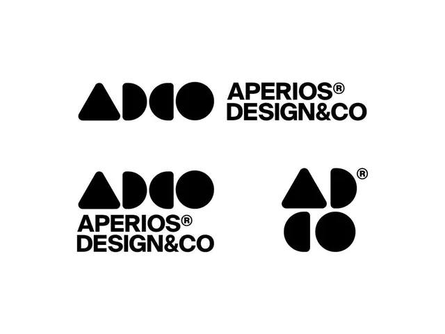
A monochromatic geometric logo for Aperios Design & Co composed of abstract shapes (triangle, semi-circles, full circle) that scale across lockup formats.
Summary
A modular geometric mark for design agency Aperios, composed of three shapes (filled triangle, semi-circle left, semi-circle right, full circle) that arranges into a flexible system and pairs with bold sans-serif wordmark.
Visual description
The mark comprises four basic geometric elements arranged horizontally in a tight group: a filled black triangle, two semi-circles forming a rounded shape, and a complete circle. The wordmark "APERIOS DESIGN&CO" sits to the right in all-caps, sans-serif, heavy weight. The system demonstrates three scales: the full horizontal lockup in a stacked format below, a horizontal variant with text underneath, and a solo mark-only symbol (triangle and two semi-circles stacked vertically with a circle on the opposite side). All elements are pure black on white, with no colors or gradients.
Key takeaway
The stacked geometric-shape approach to mark building, allowing modular recombination. The tight integration of mark and wordmark into a unified lockup rather than a detached mark. The scale flexibility showing how to handle different composition needs from full text to icon-only.
Reuse notes
Strong for design studio, architecture, or tech-forward brands where geometric abstraction signals sophistication and order. The monochromatic execution demands clarity in proportions. Works well at small scale and in grayscale reproduction because of high contrast.