Preview image. Unlock full-res
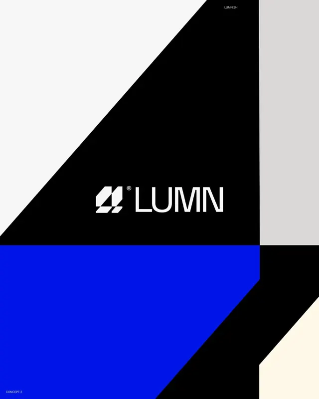
A logo featuring a chunked white geometric mark and sans-serif wordmark, set against asymmetric diagonal fields of black, blue, and cream.
Summary
A modular geometric mark and clean sans-serif wordmark set within a dynamic composition of bold black, electric blue, and light backgrounds divided by sharp diagonals.
Visual description
Composition divided by a thick diagonal from upper left to lower right. Upper left quadrant: light gray-cream background with "LUMN.SH" in small black sans-serif at the top. Upper right quadrant: pure black background. Lower left quadrant: bright electric blue. Lower right quadrant: off-white. The LUMN logo itself (a registered-trademark symbol plus a geometric mark made of two stacked white rectangles angled slightly) sits centered in the black quadrant. The wordmark "LUMN" is set in bold, modern sans-serif, also in white, positioned to the right of the mark. Sharp, clean geometry throughout; no curves or gradients.
Key takeaway
The power of diagonal axis-splitting to create dynamic balance without asymmetry feeling chaotic. The choice to reserve the boldest color (electric blue) for the smallest area, anchoring the brand visually. The geometric mark's chunky, modular construction, which stays legible even at very small sizes. The restraint of a single supporting color plus black and white.
Reuse notes
Ideal for technology, fintech, or B2B brands aiming for confidence and clarity. Works as a standalone mark or with the wordmark. The diagonal composition reads as contemporary without dating quickly. Can be adapted to many contexts by rotating or shifting the field colors. Less suitable for warm, organic, or approachable categories.