Preview image. Unlock full-res
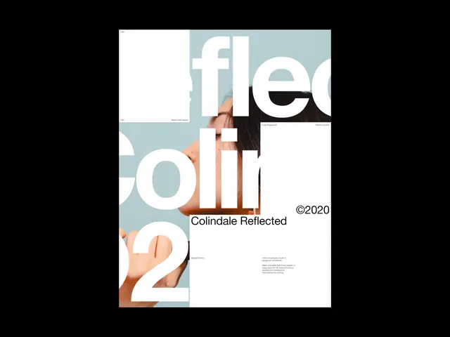
A split-screen type specimen for the Colindale typeface family, pairing large sans-serif display type with cropped hand imagery on a black and white grid.
Summary
A split-screen type specimen for the Colindale typeface family, pairing large sans-serif display type with cropped hand imagery on a black and white grid.
Visual description
A centered square composition divided into four quadrants on a black background. The upper-left is pure white; the other three quadrants alternate between white and a muted blue-grey. Large white sans-serif type occupies the space, with partial letterforms (parts of "f", "l", "e") overlapping the grid. A cropped photograph of hands (one holding a stone or sphere) appears across two quadrants in muted blue-grey. Small typographic details and a sans-serif "Colindale Reflected" label appear in black serif type, with "2020" and minimal body copy in the lower right. The overall effect is highly geometric and modular, emphasizing the typeface's modern, rational letterforms.
Key takeaway
The asymmetric composition that lets the typeface and photography vie for attention without either dominating; the bold white-on-grey and white-on-white contrast that makes letterforms read as abstract shapes; the restraint in type selection (one typeface, two weights, one color) creates a cohesive publication feel.
Reuse notes
Excellent for editorial branding or a publication identity system. Works best when you have a strong photographic asset to pair with type. The monochrome + white color restriction forces clarity and would suit media, publishing, or high-end design portfolio work.
More like this






Keep what you find
A free account saves references to boards and can send you a weekly email of picks based on what you save.
To see every result, go Pro.