Preview image. Unlock full-res
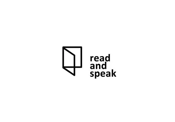
A paired mark and logotype reading 'read and speak', with a geometric book-like icon in black paired alongside bold sans-serif type on white.
Summary
A paired mark and logotype reading 'read and speak', with a geometric book-like icon in black paired alongside bold sans-serif type on white.
Visual description
The mark on the left consists of two overlapping squares, one rotated 45 degrees and partially open, creating the impression of an open book or folded page. The type sits flush to the right in a bold, sans-serif weight, with three tightly stacked lines reading 'read / and / speak' in all lowercase. The black mark (#010101) and letterforms sit on a white background, creating a clean horizontal lockup with generous spatial breathing room. The proportions suggest the mark and type are equally weighted in the composition.
Key takeaway
The book form abstracted to pure geometry, immediately recognizable but never literal. The stackable logotype (breaking across lines) adds flexibility for both horizontal and vertical applications. The intentional restraint to single-weight sans-serif reinforces clarity and modernity without relying on typeface personality.
Reuse notes
Strong identity for educational, publishing, or media brands seeking to communicate openness and clarity. The book reference makes it particularly apt for literacy, learning, or content-driven organizations. Works at any scale and translates well to digital (favicon, watermark) and print applications.