Preview image. Unlock full-res
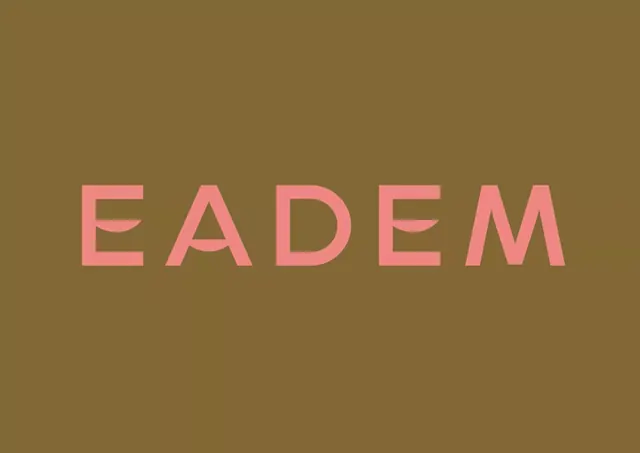
Large-format wordmark for Eadem brand rendered in soft muted pink on warm olive-tan background, demonstrating color contrast and typographic simplicity.
Summary
Full-width wordmark "EADEM" in soft muted pink geometric sans-serif set against warm olive-brown background, emphasizing color harmony and typographic presence.
Visual description
Centered horizontal wordmark "EADEM" in a clean, geometric sans-serif with uniform stroke weight and open letterforms. Pink hue is muted and soft (not saturated), appearing warm rather than cool. Background is a solid, warm olive-brown tone that creates an analogous color relationship with the pink. Composition is symmetrical and centered, with large white/negative space above and below. No supporting elements, imagery, or secondary typography visible, allowing the type and color pairing to carry full visual weight.
Key takeaway
The sophisticated restraint of a palette with just two colors that feel complementary rather than contrasting. The large-scale letterform spacing creates breathing room and luxury feel. Warm-to-warm color relationship (warm brown to warm pink) reads earthy and organic without being precious.
Reuse notes
Excellent for beauty, wellness, or lifestyle brands seeking understated luxury. Works on packaging, social media, and minimal environments where the type itself is the entire identity. The analogous warm palette pairs well with natural photography or organic textures. Avoid using on backgrounds that compete in warmth or saturation.
More like this

Keep what you find
A free account saves references to boards and can send you a weekly email of picks based on what you save.
To see every result, go Pro.