Preview image. Unlock full-res
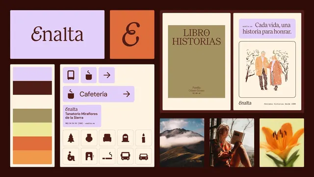
A warm identity board for Enalta, a memorial brand, combining a custom serif wordmark, a lavender-terracotta-olive palette, pictogram set, signage cards and editorial photography.
Summary
A brand presentation board for Enalta, a Spanish memorial/funeral service, arranged as a dark-bordered grid of identity assets. It is held together by a soft, humane palette of lavender, terracotta, olive and cream against deep brown, and a custom ligatured serif wordmark.
Visual description
A deep aubergine-brown frame holds a tile grid. Top left a lavender card carries the "Enalta" wordmark in a custom brown serif with a swashed cap; beside it a terracotta tile shows the standalone "E" monogram. Below, a vertical color stack samples lavender, dark brown, olive and two oranges. A cream panel presents a UI/signage system: pill buttons, a "Cafeteria" wayfinding button with arrow, a contact card, and a grid of brown line pictograms (tree, urn, sofa, candle, accessibility, bus). The right half shows applications: an olive "Libro Historias" book cover in serif, a lavender-headed card reading "Cada vida, una historia para honrar." with a hand-drawn illustration of an elderly couple, and three photographs (a misty mountain, a woman reading by a window, a backlit orange lily). Type mixes the display serif with a workmanlike sans for UI and captions.
Key takeaway
Reframing a funeral brand away from cliche by pairing an unexpectedly tender palette (lavender plus warm terracotta and olive) with a soft custom serif and gentle line illustration. The single dark-brown frame unifies a very mixed asset set (wordmark, color stack, UI, photography) into one calm board.
Reuse notes
A reference for sensitive, care-led brands (memorial, healthcare, wellness, hospice) that need warmth and dignity over sterility. The lavender-terracotta-olive trio is distinctive and travels well; the line-pictogram set shows how to keep functional wayfinding on-brand. Hold the dark brown for borders and type so the soft tones stay foreground.
More like this



Keep what you find
A free account saves references to boards and can send you a weekly email of picks based on what you save.
To see every result, go Pro.