Preview image. Unlock full-res
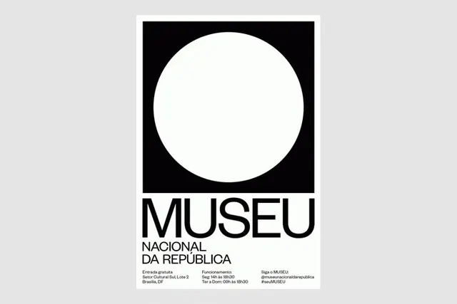
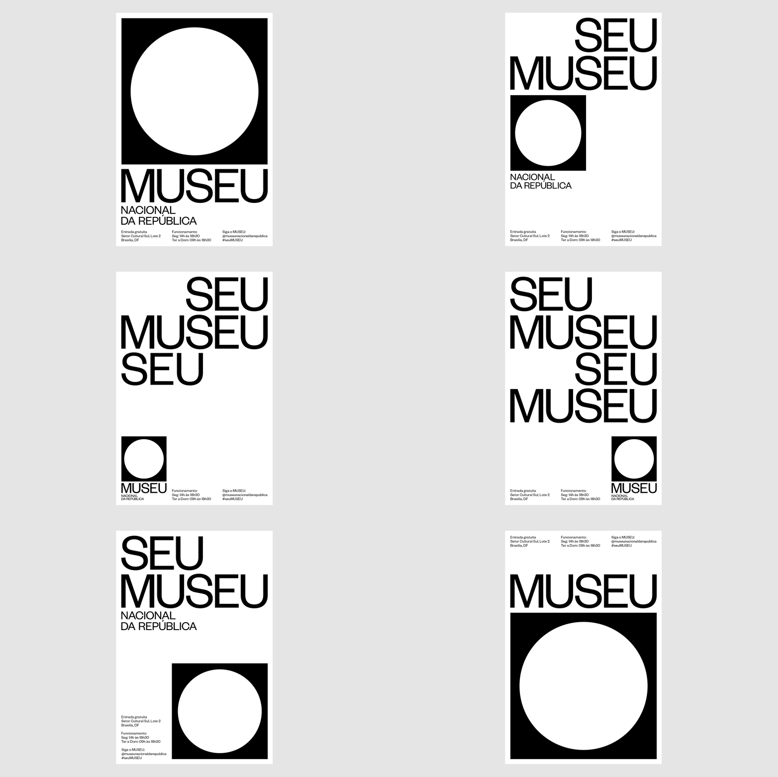
Brazilian museum identity with a centered white circle mark on a black square above lockup text, accompanied by hours and social information.
Summary
Brazilian museum identity system with a geometric mark (white circle within black square) paired with clean sans-serif lockup and operational details.
Visual description
A centered white circle sits inside a black square, creating maximum contrast and visual clarity. Below the mark, the text reads "MUSEU" in large geometric sans-serif, followed by "NACIONAL DA REPÚBLICA" in the same typeface. Small sans-serif text at the bottom provides address (Setor Cultural Sul, Lote 2, Brasilia, DF), hours (Segunda a sexta 14h as 18h30; Tuesday to Sunday 09h as 18h30), and social handle (@museunaciionaldaRepública). The entire composition sits on a light gray background. The logo exists in multiple sizes and uses throughout a system.
Key takeaway
The pure geometric primacy of the mark itself, where a circle-in-square shape needs zero embellishment. The discipline of a single sans-serif for all hierarchy levels, scaled and weighted only. The inclusion of operational information (hours, address, social) in the primary branding asset, treating logistics as core identity, not footnotes.
Reuse notes
Works for any nonprofit, cultural, or public institution wanting to convey permanence and clarity. The circle-square relationship is intentional geometry that reads across scales. Avoid using if brand needs warmth or personality beyond authority; this voice is strictly institutional.