Preview image. Unlock full-res
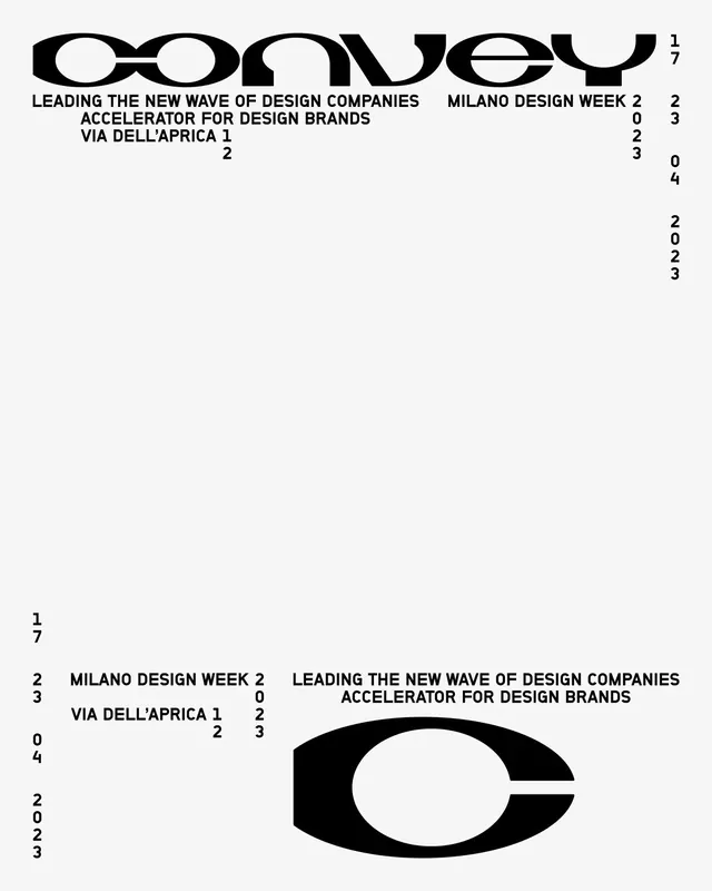
Milano Design Week event poster pairing a bold geometric sans-serif wordmark with scattered numeric coordinates and a central black eye-shaped form, creating a data-driven, contemporary design system.
Summary
Milano Design Week poster that pairs a geometric sans-serif wordmark with a grid of scattered numeric coordinates and a central black eye form, establishing a cohesive data-driven visual identity.
Visual description
A cream background with a bold geometric sans-serif wordmark at top-left; thin-stroke sans-serif text below states "LEADING THE NEW WAVE OF DESIGN COMPANIES ACCELERATOR FOR DESIGN BRANDS VIA DELL'APRICA 1". Numeric coordinates scattered asymmetrically throughout the composition (numbers like 17, 23, 02, 04, 2023) in various sizes create a sense of precision and structure. At the bottom-right, a large simplified black eye-shape with curved upper and lower lids and a white center acts as a geometric focal point. The layout balances typography across all four quadrants with generous white space.
Key takeaway
The use of coordinate grids as a visual system beyond decoration, embedding practical information into the poster layout. The paired eye-form logo feels both organic and geometric. The mixing of different text scales and weights creates hierarchy without visual clutter.
Reuse notes
Strong for event marketing, design conferences, and institutional branding where data visualization or technical precision is part of the narrative. The eye form reads as distinctive rather than generic. Works best on light backgrounds with dark typography.