Preview image. Unlock full-res
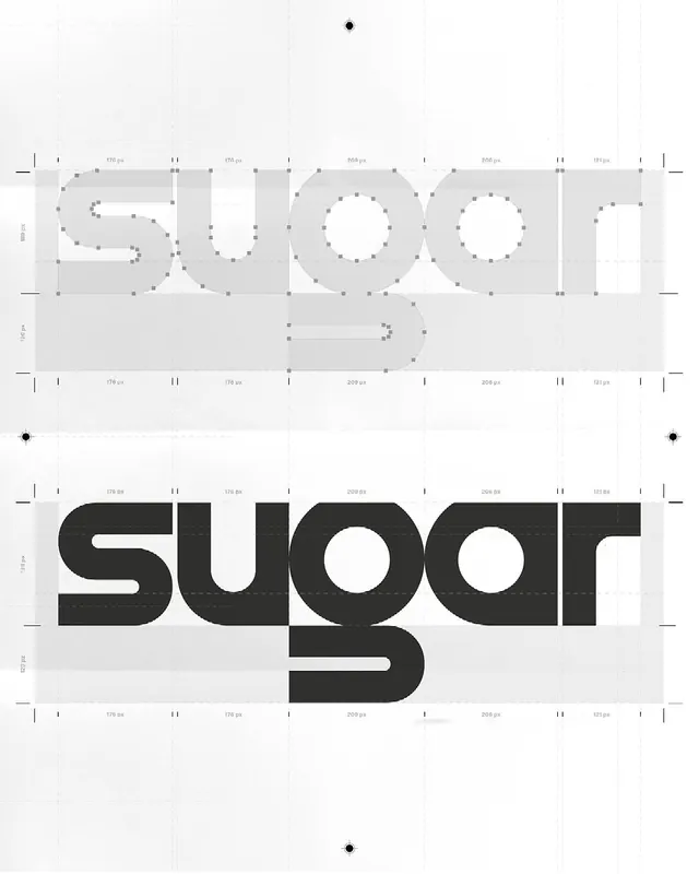
Type specimen showing a geometric sans-serif typeface with superimposed construction grid, measurements, and dotted stroke guides demonstrating the font's modular letterform anatomy.
Summary
Type specimen showing a geometric sans-serif typeface with superimposed construction grid, measurements, and dotted stroke guides demonstrating the font's modular letterform anatomy.
Visual description
The top two-thirds displays the word "SUGAR" as an outlined construction drawing with a fine grid overlay, measurement annotations along the edges in pixels, and dotted lines tracing the geometric curves and stroke centers. The bottom third presents the finished typeface: bold, chunky geometric sans-serif letters in solid black with generous counter-space. White background with light gray construction zones emphasize the structural logic. Precise alignment marks and numerical measurements throughout.
Key takeaway
The construction overlay technique shows type design rationale visually, turning the specimen itself into documentation of the modular grid logic. The high contrast between fine construction lines and bold finished letters makes the design decisions legible. This approach works for any typeface with geometric underpinnings.
Reuse notes
Strong reference for type design presentations, font foundry marketing, or showing clients how geometric logic drives letterforms. The construction-over-finished-form stacking makes it suitable for design education materials and brand guidelines that explain typographic systems.
More like this









Keep what you find
A free account saves references to boards and can send you a weekly email of picks based on what you save.
To see every result, go Pro.