
Preview image. Unlock full-res
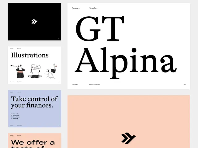
A multi-page brand system grid mixing black-and-white typography layouts, pointillist pattern fields, and large serif type specimens on clean white spreads.
Summary
A multi-page brand system grid mixing black-and-white typography layouts, pointillist pattern fields, and large serif type specimens on clean white spreads.
Visual description
A patchwork of guideline pages arranged in a grid layout. The spread includes pages with prominent sans-serif wordmarks set in large display type, crisp sans-serif body text, and a standout black page filled with evenly spaced white dot patterns (a pointillist or halftone grid). A serif-focused page displays the word "FOCUS" in oversized serif type with minimal surrounding elements. Horizontal rules, consistent margins, and centered compositions create visual rhythm. The palette is strictly black, white, and grays. All pages use full bleeds or centered layouts with generous white space, reinforcing a refined, corporate aesthetic.
Key takeaway
The pairing of serif display type with a geometric dot-pattern page creates contrast within a unified system. The consistent use of gridded negative space and restrained geometry makes each page feel like part of a deliberate whole. The serif-in-modular-sans context is uncommonly sophisticated.
Reuse notes
Strong reference for corporate brand guidelines, especially those targeting premium or technical audiences. The dot-pattern page works as a flexible modular element (divider, color-field equivalent in monochrome, or texture anchor). Not suited for warm, personal, or consumer-facing brands; these pages read as institutional.
More like this








Keep what you find
A free account saves references to boards and can send you a weekly email of picks based on what you save.
To see every result, go Pro.