Preview image. Unlock full-res
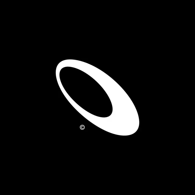
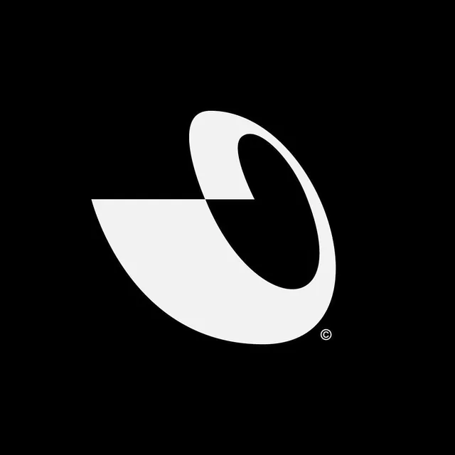
Minimal abstract logo using overlapping curved forms and negative space to create a dynamic mark suggesting motion or a stylized shape.
Summary
Minimal abstract logo using overlapping curved forms and negative space to create a dynamic mark suggesting motion or a stylized shape.
Visual description
A white curved form on pure black background, composed of two interlocking curved shapes that overlap at the center. The upper arc is more open, the lower arc more closed, creating a teardrop-like silhouette with a striking black counter-form in the middle. A copyright symbol sits in the lower right. The mark reads as both incomplete and self-contained, balancing positive and negative space with refined line weight throughout.
Key takeaway
Sophisticated use of negative space to add visual intrigue and sophistication; overlapping curved lines that suggest motion or completion without explicit detail; using high contrast (black and white) to maximize visual impact at small sizes.
Reuse notes
Ideal for tech, design, or creative services brands seeking elegance and restraint. The clean lines scale well to small formats (favicons, embossed applications, app icons). Works equally well as a standalone mark or paired with a sans-serif wordmark. The negative counter suggests forward motion or growth, suiting startups and innovators.