Preview image. Unlock full-res
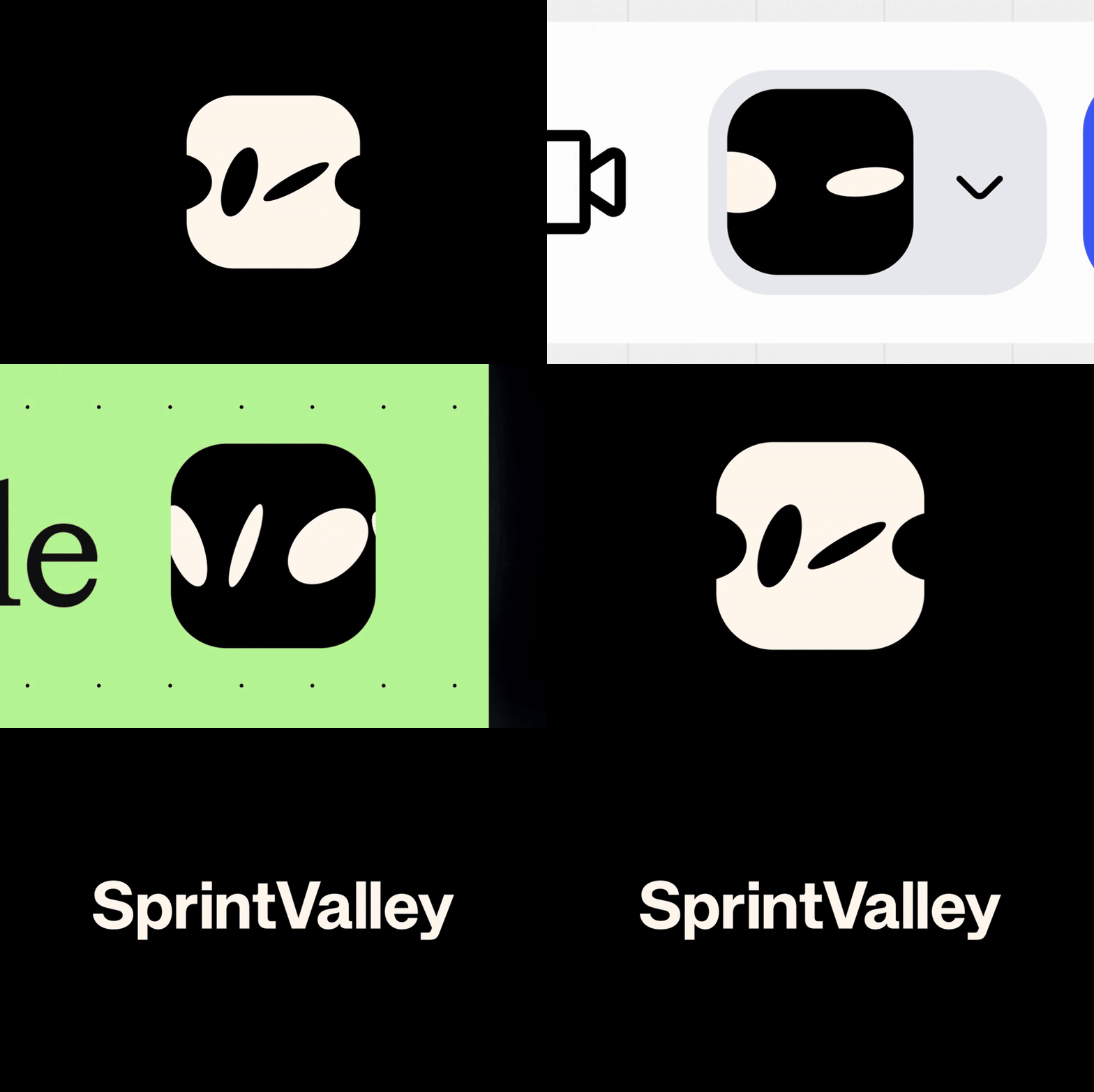
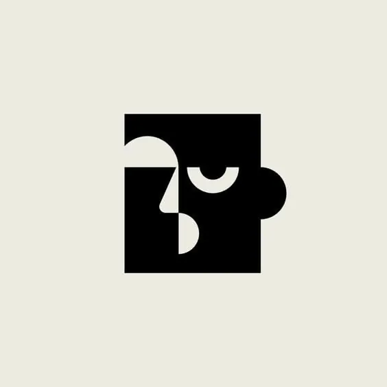
Monochrome square logo combining curved negative-space cutouts that read simultaneously as an abstract face and an interlocking puzzle piece.
Summary
Monochrome square logo combining curved negative-space cutouts that read simultaneously as an abstract face and an interlocking puzzle piece.
Visual description
A solid black rounded-square mark sits on a flat warm cream background. A circular lobe bulges from the mid-right edge, breaking the square's straight side like an ear or cheek. Within the black field, cream-colored negative-space cutouts form the ambiguous imagery: a hooked comma shape in the upper-left, a thick arched crescent at center (reading as a closed eye or eyebrow), and a teardrop/paisley shape lower-center (reading as a nose or chin). The cutout edges nest tightly against the solid black, so the same silhouette flips between an abstract face and two interlocking jigsaw-like pieces. No text, no additional color, no gradients or texture, flat black-on-cream throughout.
Key takeaway
The mark works because the negative-space cutouts are ambiguous enough to support two readings at once (face, puzzle piece) without either interpretation fighting for attention. The high black-cream contrast and simple geometric shapes keep it legible even shrunk to favicon size.
Reuse notes
Good fit for community, education, or tech brands wanting a friendly-but-clever icon; works well as an app icon or favicon since the silhouette holds up small. The ambiguity is a feature for brand storytelling but could read as too abstract if the surrounding brand identity doesn't reinforce the face/puzzle idea.