Preview image. Unlock full-res
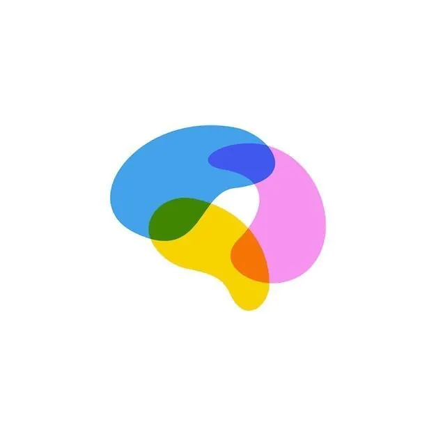
An abstract logo composed of four overlapping organic blob shapes in blue, yellow, pink, and green with soft, flowing curves.
Summary
Four interlocking organic shapes in primary and secondary colors create a playful, approachable abstract mark suitable for brands targeting youth or creative audiences.
Visual description
Four smooth, bulbous forms overlap in a circular arrangement: a bright blue shape (top left), a lime-green shape (bottom left), a bright yellow shape (bottom center), and a hot pink shape (right). Each blob curves and flows into its neighbors, creating a balanced, symmetrical composition. The color transitions are clean and flat, giving the mark a modern, digital-native appearance. The composition feels cheerful and energetic against white space.
Key takeaway
The overlapping-blobs archetype conveys playfulness and approachability without text. The color selection (warm-cool pairing) feels current and works well for apps, communities, or youth-oriented brands. The soft curves make corporate-feeling brands instantly friendlier.
Reuse notes
Perfect for consumer-facing tech, apps, creative agencies, or initiatives aiming for a vibrant, inclusive feel. Avoid pairing with stern typography or dark, formal contexts. Works well at small sizes on favicons or app icons because each color zone remains distinct.
More like this
Keep what you find
A free account saves references to boards and can send you a weekly email of picks based on what you save.
To see every result, go Pro.