Preview image. Unlock full-res
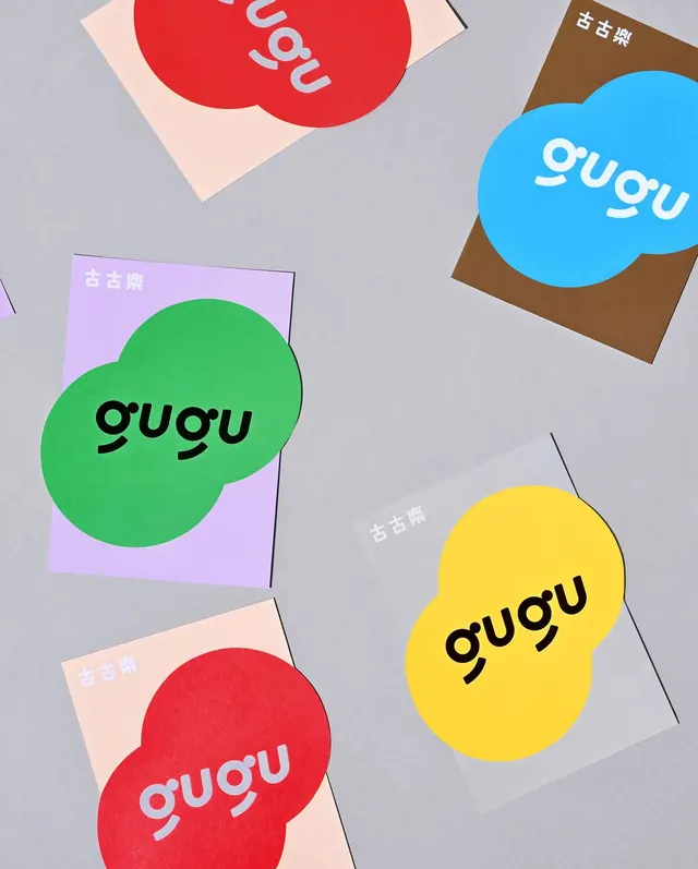
Gugu brand identity system with organic circular blob shapes in red, green, blue, and yellow, each anchoring wordmark on tilted cards with pastel cardstock backs.
Summary
Gugu brand identity system displaying four organic circular blobs in saturated red, green, blue, and yellow, each containing the white wordmark "gugu" and anchored on tilted pastel cardstock backgrounds (lavender, tan, cream, grey).
Visual description
Five tilted business or identity cards arranged on a neutral grey surface. Each card features a large organic blob shape in a single saturated hue (red, bright green, vibrant blue, or bright yellow) with the lowercase wordmark "gugu" centered in white. The cards rest on pastel-colored rectangular cardstock in muted complementary tones (soft lavender, warm tan, pale cream, muted grey). Small Chinese characters visible in corners of some cards. The composition emphasizes tactile, physical identity application. Shadows cast by the tilted cards suggest depth and dimensionality. Overall effect is modern, approachable, and energetic.
Key takeaway
The organic blob shape is a versatile, friendly container for wordmarks across a system; it softens the geometric nature of typography while staying modern. The palette of fully saturated primaries paired with muted cardstock backgrounds creates contrast without clashing. Tilted presentation on physical stock shows the identity in use and feels more authentic than a flat layout.
Reuse notes
Works for consumer brands, tech startups, and any category aiming for approachable friendliness without childishness. Blob shapes are infinitely adaptable to different sizes and proportions. Pair this approach with horizontal lockups or icon systems for a complete toolkit. The muted cardstock choices prevent the overall system from feeling too loud.
More like this

Keep what you find
A free account saves references to boards and can send you a weekly email of picks based on what you save.
To see every result, go Pro.