Preview image. Unlock full-res
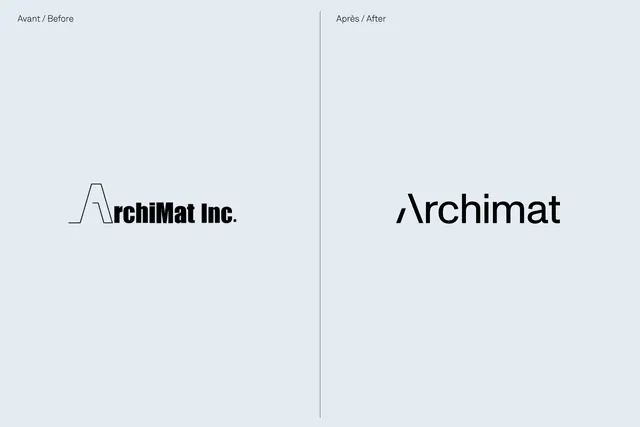
A before/after comparison of the ArchiMat identity: the original outlined 'A' letterform paired with the refined, solider wordmark version.
Summary
A split-screen comparison showing ArchiMat's logo evolution from a thin-lined, geometric 'A' to a more condensed, robust wordmark.
Visual description
Left half labeled "Avant / Before" shows the original identity: a hollow, outlined letterform 'A' on a grid structure with "rchiMat Inc." in bold sans-serif. The 'A' is constructed from geometric lines and proportioned to a strict baseline grid. Right half labeled "Après / After" presents the refined version: a sleeker, more integrated wordmark where the 'A' forms merge into solid, compact letterforms reading "ArchiMat" without the company suffix. Both rendered in black on a light, cool gray background (#E3ECF2) with a vertical divider separating them. No decorative elements; the comparison is stark and functional.
Key takeaway
The grid-based construction of the original 'A' shows structural thinking. The evolution demonstrates how removing the outline and company-style designation (Inc.) creates a more modern, condensed mark. The choice to drop decorative geometry for solid letterforms is a classic minimalist evolution.
Reuse notes
Strong reference for tech and software identities needing architectural or design credibility. The before/after format is useful for case-study portfolios or process documentation. Works for B2B brands targeting professionals. The cool gray palette is restrained; consider for corporate contexts.