Preview image. Unlock full-res
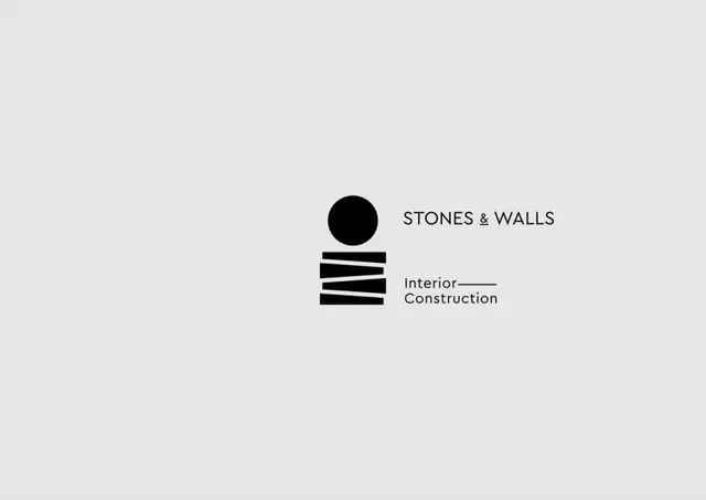
Monochrome identity for an interior construction firm pairing a stacked-lines mark with clean sans-serif wordmarks on a light grey background.
Summary
A minimal black mark of a solid circle centered above three horizontal parallel lines sits beside the company name and discipline in a clean sans-serif, conveying solidity and precision for an interior construction firm.
Visual description
Centered on a light grey background, a pure black circle sits directly above three equally-spaced horizontal bars, slightly shorter than the circle's diameter. The mark uses only geometric forms with no ornamentation or shadow. To the right, the text 'STONES & WALLS' appears in a thin, modern sans-serif in black, aligned to the mark. Below, 'Interior Construction' is set in the same typeface, smaller, and aligned to the left of the second bar, creating a two-tier text hierarchy. The entire composition is highly symmetrical and balanced, with generous negative space dominating the composition. The palette is strictly black, white, and neutral grey.
Key takeaway
The use of abstract geometric forms (circle and bars) to symbolize both the materials (stones as circular/solid, walls as horizontal) and the industry (construction as organized, structural); the alignment strategy that locks the text to the mark without explicit containers; the restraint in using only one thin typeface and pure monochrome, allowing the mark to carry all the visual weight.
Reuse notes
Excellent template for architecture, construction, real-estate, and interior-design firms. The circle-and-bars form is legible at small sizes and translates to embossing, signage, and digital use. The composition is highly versatile: the mark alone works as a favicon; the full horizontal lockup works for business cards and letterheads. The monochrome palette is professional and timeless, but may feel cold or austere in contexts needing warmth; pair with warmer materials (natural wood tones, earthy palettes) to soften the effect.