Preview image. Unlock full-res
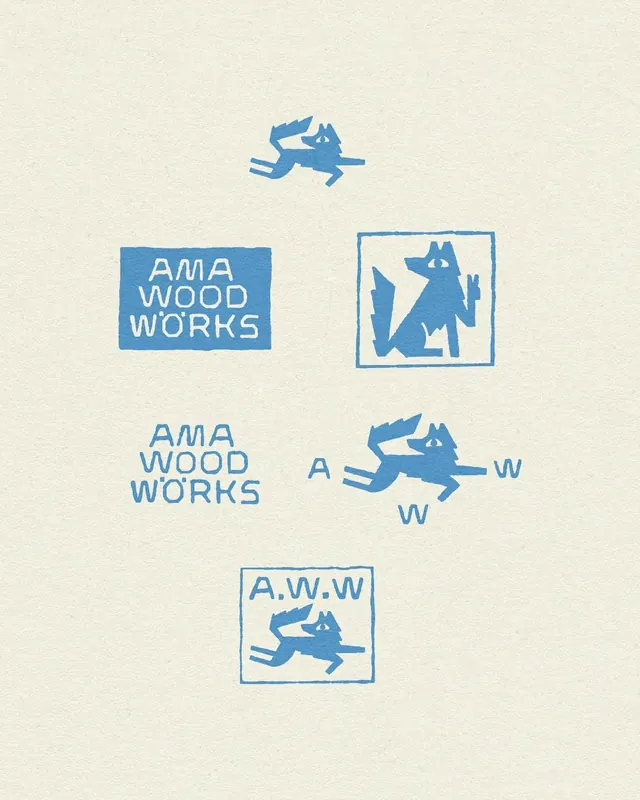
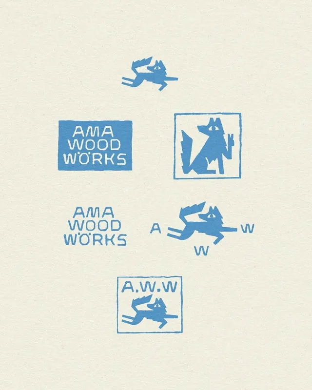
Woodworking brand identity using a geometric hare silhouette paired with serif and sans-serif typographic treatments in cool blue and cream.
Summary
Woodworking brand identity system using a stylized jumping hare rendered in geometric line art, paired with both serif and sans-serif treatments of "AMA WOOD WORKS" against a cream background.
Visual description
A cream-colored background hosts five variations of the AMA Wood Works identity. At top, a blue line-art hare leaps above the composition. Below are four treatments: a filled blue rectangle with white serif type stacked as "AMA WOOD WORKS"; a blue-bordered square containing a geometric hare abstracted into sharp, stacked silhouettes; a horizontal lockup with blue sans-serif type flanking a centered hare ("A W W"); and a bottom boxed square framing "A.W.W" text with the hare above it. All elements use the same cool blue throughout, creating a cohesive identity system with three core components: a memorable mascot, modular typography, and flexible layout options.
Key takeaway
The geometric animal mascot works as both standalone glyph and integrable element. The restraint of three letter-based lockups (full name, initials, abbreviated) demonstrates how a single identity can scale from a label to a business card. The consistent stroke weight and line quality across all variants creates unity despite compositional differences.
Reuse notes
Strong for craft, artisan, or maker brands needing a memorable mascot with heritage feel. The cool-blue-on-cream color scheme reads as both contemporary and timeless. Works well at small scale (embroidery, stamps, seals) and large format (signage). The geometric approach to the animal form makes it reproducible in multiple mediums without losing clarity.