Preview image. Unlock full-res
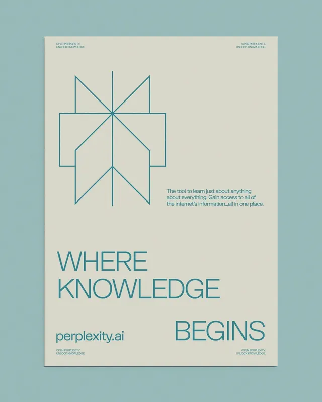
A muted beige poster for perplexity.ai pairing a teal line-art seal with stacked oversized type reading WHERE KNOWLEDGE BEGINS.
Summary
A branding poster for perplexity.ai, shown as a framed mockup, built on a pale beige sheet with everything drawn in a single muted teal: a geometric line-art emblem up top and an oversized headline below.
Visual description
The poster is presented inside a thin frame against a slightly darker teal-grey wall. The sheet itself is warm off-beige with all ink in one muted teal. Tiny captions are tucked into all four corners. Near the top sits a symmetrical line-art mark, an arrow or compass-like emblem built from straight strokes and overlapping outlined squares. A short three-line paragraph sits mid-page. The lower third carries the headline in large all-caps sans-serif, set left as WHERE / KNOWLEDGE and then BEGINS dropped to the bottom-right, with the lowercase wordmark perplexity.ai anchoring the bottom-left. Generous negative space throughout; the layout is grid-disciplined and quietly Swiss.
Key takeaway
The strict two-tone discipline: one ink color on a tinted paper makes line-art and heavy type feel like one system. Splitting a three-word headline so the final word jumps diagonally across the page creates motion without any graphic device. Corner micro-captions add a technical, archival texture.
Reuse notes
Good reference for an AI or knowledge-product brand poster, editorial cover, or about-page hero where restraint signals credibility. The monochrome-on-tinted-paper trick adapts to any brand color. Keep the headline short; the diagonal word-drop needs breathing room to read.
More like this


Keep what you find
A free account saves references to boards and can send you a weekly email of picks based on what you save.
To see every result, go Pro.