Preview image. Unlock full-res
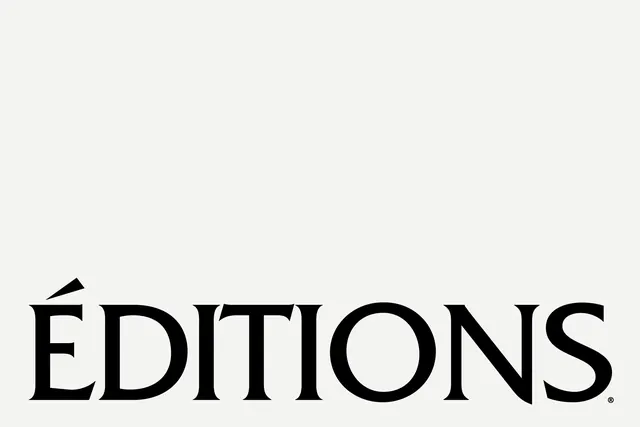
Didot-style ÉDITIONS logotype centered low on an off-white field with vast negative space.
Summary
Black high-contrast serif ÉDITIONS with registered mark sits low on a pale grey-white ground.
Visual description
Tight capitals with thin hairlines and thick stems. Upper two-thirds empty; text horizontally centered near the bottom edge.
Key takeaway
Extreme vertical breathing room elevates a simple serif name into luxury publishing territory.
Reuse notes
Fashion imprints, gallery identities, or premium editorial mastheads.
More like this

Keep what you find
A free account saves references to boards and can send you a weekly email of picks based on what you save.
To see every result, go Pro.