Preview image. Unlock full-res
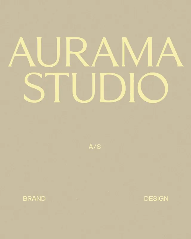
A brand-cover layout setting a large pale-yellow serif AURAMA STUDIO wordmark on a grainy sand background, anchored by A/S and the words BRAND and DESIGN.
Summary
A studio brand cover built entirely from type: an oversized two-line serif wordmark in pale yellow floats on a grainy sand field, with a small monogram and two anchor words doing all the supporting work.
Visual description
A warm taupe-sand background carries a subtle film grain across the whole frame. Centered in the upper half, AURAMA over STUDIO is set in a high-contrast all-caps serif at near-poster scale, in a soft pale-yellow only a shade lighter than the ground so it reads quiet rather than loud. A small A/S monogram sits mid-frame as a breath between the wordmark and the footer. Along the bottom, BRAND on the left and DESIGN on the right are set small in the same serif, framing the composition. The tight tonal palette keeps everything within a narrow warm band.
Key takeaway
Keeping the wordmark only a step lighter than its background so the identity feels expensive and understated instead of shouting. The grain texture adds analog warmth to flat color. Bracketing the layout with two small footer words (BRAND / DESIGN) gives structure without a rule or box.
Reuse notes
A go-to cover or first slide for a design studio, fashion or wellness brand that wants restraint and warmth. Lean on a genuine high-contrast serif to carry the scale. The low type-to-ground contrast is the whole point but reduce it further and legibility suffers, so test at small sizes.
More like this


Keep what you find
A free account saves references to boards and can send you a weekly email of picks based on what you save.
To see every result, go Pro.