Preview image. Unlock full-res
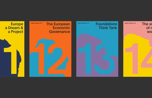
Four numbered report covers using map silhouettes to cut large numerals from bold color fields.
Summary
A quartet of Coppieters Foundation Paper Series covers pairs huge numbers with European map cutouts.
Visual description
Four vertical covers sit in a row on dark gray. Each uses a two-tone scheme: yellow/navy, orange/cyan, blue/purple, pink/yellow. Small navy titles sit top-right while Paper Series labels appear top-left. Enormous numerals 1, 12, 13, and 14 occupy the lower two-thirds, formed by map silhouettes punching through the ground color.
Key takeaway
Repeating grid and title placement with swapped duotone pairs builds a series identity while map silhouettes give each number meaning.
Reuse notes
Think-tank publications, policy report systems, or academic series needing bold index numbers with geographic context.
More like this






Keep what you find
A free account saves references to boards and can send you a weekly email of picks based on what you save.
To see every result, go Pro.