Preview image. Unlock full-res
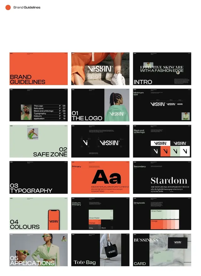
Eighteen-page VISKIN skincare identity system presented as a 3-column grid, anchored on a coral, black, and sage palette with a notched angular wordmark.
Summary
A complete brand identity system for VISKIN skincare shown as eighteen pages tiled in a 3-column grid, demonstrating logo construction, typography, color palette, and real-world applications across packaging and editorial photography.
Visual description
The grid opens with a small coral dot and "Brand Guidelines" header, then shows eighteen cards in strict columns: a solid-coral cover, a fashion-photography introduction with the slashed VISKIN wordmark cutting diagonally across fabric, an all-black intro slide, a numbered contents list, a green-jacketed "01 The Logo" page, technical diagrams showing minimum size and safe-zone geometry, logo construction studies on color chips, an oversized primary typeface specimen in all-caps "Aa" on coral, a serif secondary specimen labeled "Stardom" on black, a phone mockup in coral, two color-swatch pages showing the palette's structure and a greyscale tint-and-shade system, and application spreads: eyewear on a styled model, a black tote bag, and a business card on marble. Every page anchors to the same coral-black-sage triad. The custom wordmark cuts sharp diagonal notches into its letterforms, distinguishing it from a standard sans-serif.
Key takeaway
Presenting an entire identity system as a uniform grid of identically sized tiles creates instant visual cohesion and signals systematic thinking. Running all color accents through a tight three-color triad, then letting photography provide warmth and variation, keeps the system disciplined without feeling flat. A subtle custom construction in a single mark, like the notched letterforms, gives an otherwise straightforward grotesque a memorable signature.
Reuse notes
Use as a checklist for what pages a brand-guidelines deck must contain: logo mark, safe-zone rules, type hierarchy, color system, and applications across product and editorial contexts. The grid format is strong for presenting a system at a glance to stakeholders or for mockup portfolios. Caveat: individual pages are small and not meant to be read closely; reference this for system structure and palette inspiration, not for fine typographic detail.
More like this


Keep what you find
A free account saves references to boards and can send you a weekly email of picks based on what you save.
To see every result, go Pro.