Preview image. Unlock full-res
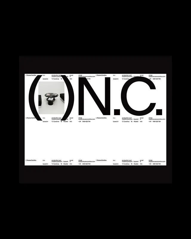
Bold sans-serif wordmark with a real camera product photograph inserted into the center of the O, set within a gridded branding layout.

Summary
A bold, all-caps sans-serif wordmark that integrates a real product photograph of a camera into the center of the O, surrounded by a gridded repetition of brand information.
Visual description
The wordmark O.N.C. is rendered in large black sans-serif capitals on a white background. The O serves as a frame for a real product photograph of a camera or lens setup, cropped to fit within the letterform. The entire composition sits within a structured grid where contact information (O'NuscheCardina branding, production and creative practice details, based in Madrid, email, phone number) repeats in corners and edges. The strict grid structure and monochromatic palette create a clean, professional brand presentation.
Key takeaway
Using real product photography as a letterform fill creates a memorable, distinctive logo that directly showcases the company's output. The grid system reinforces brand consistency and suggests a design-focused practice.
Reuse notes
This approach works well for design studios, production companies, or creative agencies whose physical product is part of their brand story. The photograph-inside-letterform technique makes the wordmark distinctive and gives it narrative depth. Best applied at larger display sizes where the product detail remains legible.
More like this





Keep what you find
A free account saves references to boards and can send you a weekly email of picks based on what you save.
To see every result, go Pro.