Preview image. Unlock full-res
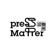
A minimal wordmark pairing lowercase Latin sans-serif with a custom geometric mark integrated above, set in monochromatic black and white.
Summary
A minimal logotype combining lowercase sans-serif English text with a custom monoline mark positioned above, using negative space and geometric precision.
Visual description
Horizontal wordmark on white background: lowercase sans-serif text "press" in heavy black, followed by the word "Matter" below it. Above the text sits a custom geometric mark, a stylized closed curve resembling a sideways 'S' or looped line, drawn with a single consistent stroke weight. To the right, small East Asian characters (Chinese or Japanese) appear in similar proportions. The entire mark occupies minimal horizontal space, with generous white area around it. All geometry flows from the same monoline stroke approach, creating a unified, refined aesthetic.
Key takeaway
The bilingual approach without hierarchy collision. The custom mark above the type avoids the stacked mark-under-text cliche. The monoline geometric mark pairs perfectly with the sans-serif weight, making them feel like one system rather than layered elements.
Reuse notes
Works for minimalist professional brands (consulting, publishing, design). The lowercase text keeps it approachable despite the geometric mark. Pair with generous white space. The bilingual integration is clever for global or cultural brands; the small second mark reads as a detail, not a distraction.