Preview image. Unlock full-res
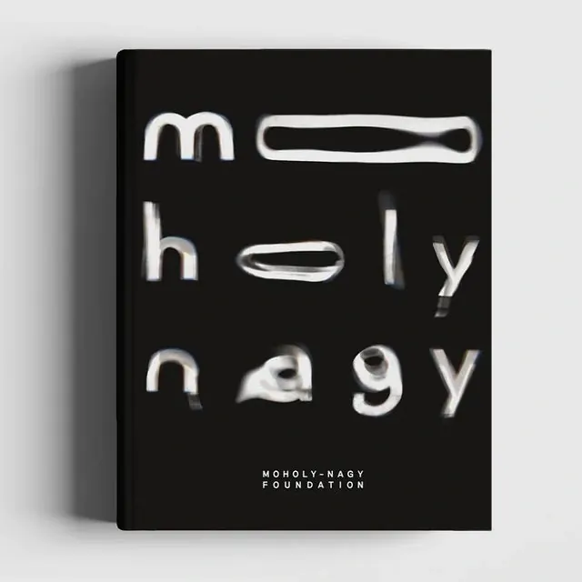
Black book cover with distorted white typography and institution text at the base.

Summary
A book cover featuring an avant-garde typographic treatment with highly distorted, abstracted letterforms in white against black, grounded by the clearly legible institution name in small caps at the bottom.
Visual description
A dark book spine visible from the side frames a black front cover. Large distorted white letterforms fill the upper portion, their shapes warped and unconventional, creating visual interest through abstraction rather than legibility. At the bottom in crisp small-cap sans-serif: "MOHOLY-NAGY FOUNDATION" in white, providing clear institutional identity.
Key takeaway
The contrast between unreadable, expressive typography and the clearly legible institution name creates intrigue while maintaining brand clarity. Distortion as a design element conveys artistic sophistication and forward-thinking identity.
Reuse notes
Effective for design-focused institutions, educational organizations, or avant-garde publishers seeking to signal progressive thinking. The distorted-legible balance works when the institution name is still clear and accessible to viewers.
More like this






Keep what you find
A free account saves references to boards and can send you a weekly email of picks based on what you save.
To see every result, go Pro.