Preview image. Unlock full-res
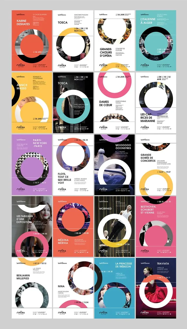
Grid of 25 opera marketing posters each featuring a large circular photo frame, vibrant background colors, and consistent OPÉRA branding system.
Summary
A cohesive system of 25 opera house marketing posters arranged in a grid, each using a distinctive circular frame window containing performance imagery and supported by bold, colorful backgrounds.
Visual description
Grid layout (5 columns x 5 rows) of individual posters, each 3-4 inches tall. Each poster features: a solid background color (rotating through red, orange, yellow, teal, cyan, purple, pink, black, white, and gray), a large circular die-cut frame or photo window in the center showing operatic performers or scenes in photographic color, French opera titles and composer names in heavy sans-serif caps (Karine Deshayes, Tosca, Grands Choeurs d'Opéra, etc.), event dates, venue information, and consistent OPÉRA logo at bottom. Some posters layer photographic elements outside the circle (portrait crops, performance stills). Typography uses sans-serif in whites, blacks, and accent colors. A harmonious visual system unifies the collection through the circular motif and consistent grid structure.
Key takeaway
The circular frame becomes the anchor of a strong visual identity, allowing photographic content to shine while colorful backgrounds differentiate each show. The consistent application creates a cohesive brand presence across many disparate productions.
Reuse notes
Exemplary for theater, performing arts, or cultural institutions with multiple productions. The circular crop is memorable, works across print scales, and allows photography to carry narrative. The color variation system maintains consistency while feeling fresh per item. Consider adapting this circular-window approach for gallery shows, music festivals, or event series where diversity and bold visual contrast are desired.